Square Wallet is Almost Awesome
November 18, 2013 📬 Get My Weekly Newsletter ☞
If you’ve ever been on a vacation where you don’t have perfectly fast network access, and tried to use popular social-networking apps, you can probably identify with my tweet:
This I know: the developers of Instagram, Facebook, and Tripit have never been on a vacation where they used the app they develop.
— ❺➠ David Copeland (@davetron5000) October 26, 2013
I use a lot of applications from companies that present themselves as developer-friendly, agile, forward-thinking, and product-focused. Despite that, these products have very obvious flaws that, to my thinking, reduce the value to both the company and its users (unlike, say, Google Ads, which only reduce value to users).
Tearing apart the three apps I mention above will be an undertaking, so I’d like to start with an app I really, really like, and use almost every day: Square Wallet.
What it is
If you haven’t used Square Wallet, it’s ostensibly an app to allow you to pay for things with Square instead of using cash or your credit card. The happy path case is that you walk into a participating store (which I think is almost exclusively Starbucks), and the store scans a QR code on your phone, conducting the transaction.
I work frequently out of Starbucks because a) they reliably have iced tea, b) their Internet is usually pretty decent, and c) it’s close to home. So, I used Square Wallet a lot. And I can tell you, there’s no way the product team for this app really, truly uses it (and I’d bet my life savings no one on the product team uses an iPhone 4).
How it works.
The basic flow of the app is as follows:
- Launch the app
- App uses your location to identify Square-supported businesses
- Tap on Starbucks
- You are shown a QR code
- Scan the QR code
This seems reasonable enough, but if you have a close eye, you can spot the problem.
The problem
First, let’s talk about steps 1 and 2. The process of launching the application and doing the location search are slow.
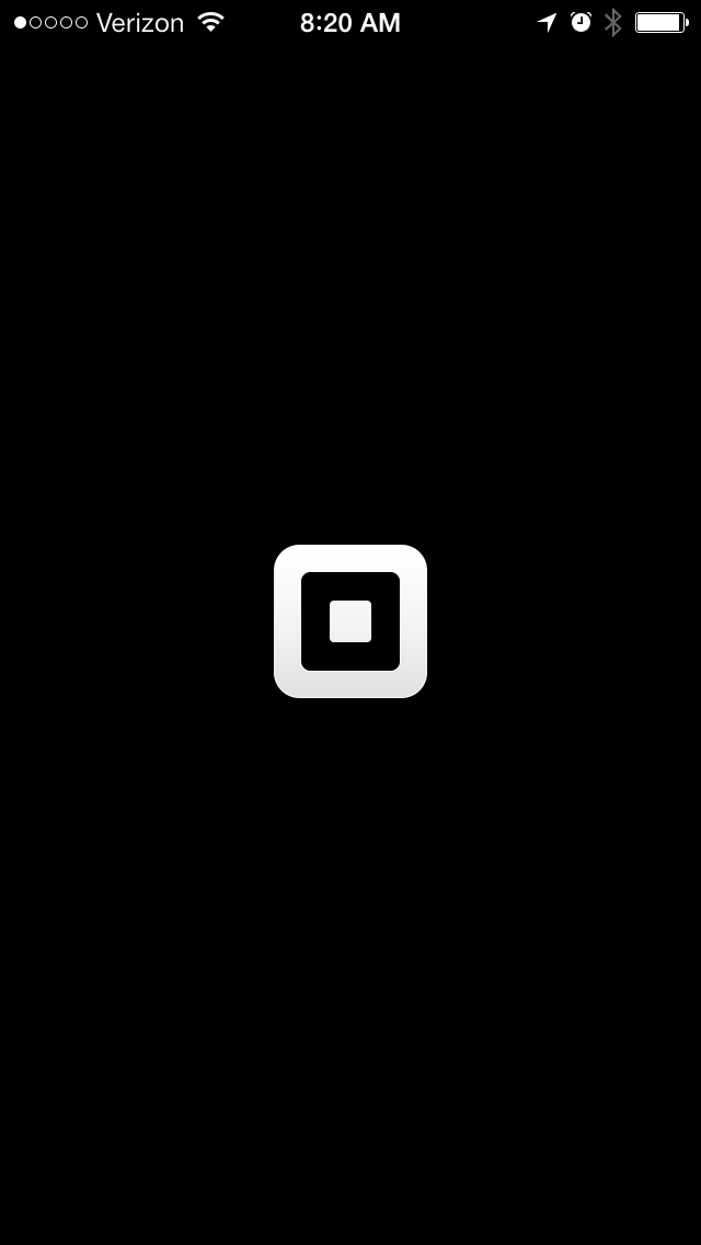
On older iPhones, just launching is interminable:
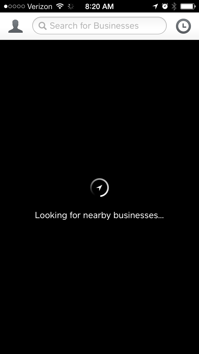
And then, the location lookup takes what seems like forever, especially if you don’t have really fast Internet.
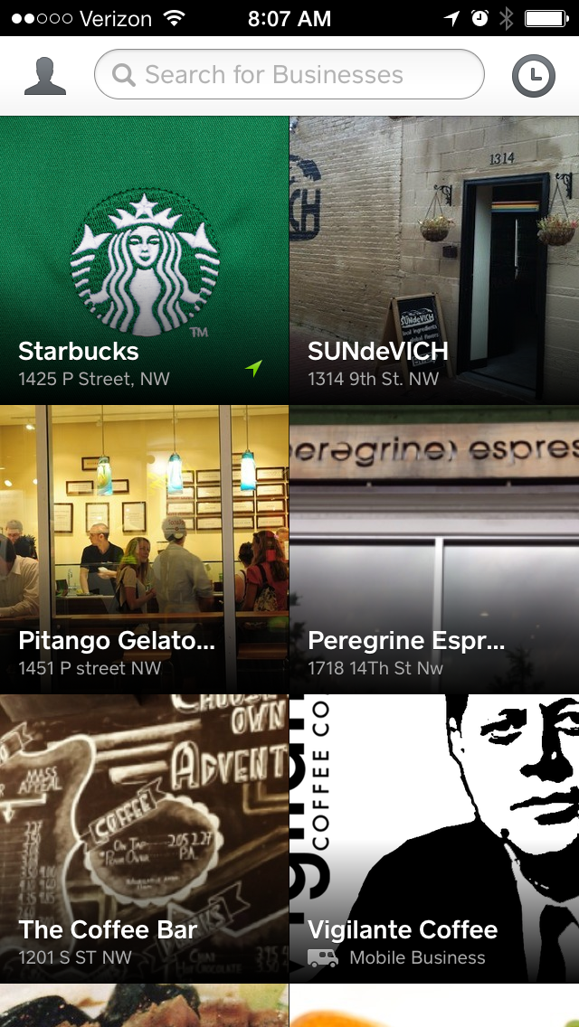
Once that’s done, I then need to navigate a two-dimensional list of business to find the one I want.
Starbucks is almost always in the upper-left. Almost. Visually navigating a two dimensional list is markedly more difficult than a one-dimensional list. This screen may look nice, but it’s hard to use.
So, the way I end up using this is to “boot up” the app when I walk into Starbucks, so that the QR code is ready by the time I get through the line (I have a brand new iPhone 5S).
What I don’t understand is that all of this is to get the application to reveal a static image of a QR code that, as far as I can tell, never changes. I could just print it out. This should be the default behavior of the application—I should launch it and see this QR code. Or, better, the application should use Passbook, like the official Starbucks app:
- Take out iPhone when I’m in Starbucks
- Swipe open the lock screen—now displaying a Passport alert—to display a scannable image
- Scan and Pay
It’s fast. It’s fast for me and fast for the cashier. The reason I don’t use it is because it requires Funny Money™. I have to constantly reload it and manage the balance. Square solves that problem perfectly by being a proxy to my credit card. It seems to me that if the idea is to use my location to present me with information to pay the business at that location, Passbook is the exact feature needed to implement that1.
So I have to wonder what the Square Wallet product team actually does with Square Wallet and where are their priorities about product features? Maybe they never go to Starbucks and only go to some food truck that, because it’s in San Francisco, actually accepts Square Wallet directly. Have they even used the Starbucks app? If I were on that team, the second I used the Starbucks app, I’d bring it to the team’s attention and get to work. I would take it as a point of pride that my app wasn’t as easy to use as Starbucks’.
Perhaps I’m just not using the app as intended. Perhaps if I dig deeper, I can discover the true features I’m supposed to be using. Doing so only raises more questions about the product decisions that have gone into this app.
The Deeper We Go, The More Shallow it Gets
After the location search, here’s the screen you’ll see again for reference:
When I first saw this, I was really excited that I could pay with Square at all of these locations (Sundevich is one of my favorite DC sandwich shops). To be clear, I would’ve gone out of my way to visit some of these places because the at-the-counter experience of Square Wallet is so awesome. These business would get more money out of me, if I could use Square Wallet.
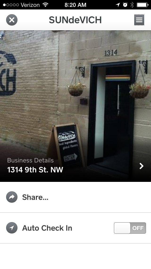
Turns out that not a single entry in this list, save Starbucks, allows me to pay with Square Wallet. I can’t think of any reason why they show up in the list at all. Clicking one reveals pretty much nothing:
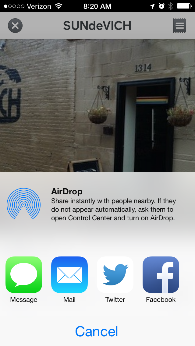
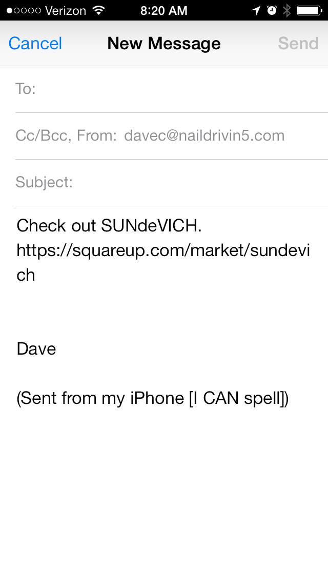
The only thing here to do is “Share”:
Who would ever do this? Why is this even here? Why did the application automatically search for businesses, download images, and provide me a screen full of links to useless information where I can do pretty much nothing? All I wanted to do was bring up a static QR code to scan at Starbucks so that I could get iced tea, and Square could get a bit off the top for providing the service.
A Bit Off the Top
Unlike Facebook and Instagram, Square has a pretty clear and easy to understand business model: take a percentage of everything you buy with Square2. As the scrappy newcomer having to compete with cash and credit cards, their only real way in is to make paying for things with Square easier than cash or credit cards.
Given this, almost every feature of Square Wallet stands in defiance of that simple goal. I cannot fathom the thinking behind adding a useless share feature at instead of streamlining the flow that directly makes them money. The Square Wallet team should be laser-focused on ensuring that the app makes it as easy as possible for me to pay using Square. That team should, in large part, be judged by how much revenue comes in from the app.
Instead, the vast majority of the app consists of phoned-in user acquisition features that get in the way of me giving them my money3.
I still use Square Wallet and will continue to, as it is still faster than cash or credit (provided I boot it up when I enter Starbucks). When I use it, I really get excited about the future. What this app does is pretty awesome and the possibilities for it seem very cool. I wish it did it in more places and I wish it did better, but I am concerned that this team’s priorities are really screwed up, and I hope that doesn’t hurt this app or Square in general.
