A real keyboard for programmers?
August 29, 2013 📬 Get My Weekly Newsletter ☞
Jeff Atwood (AKA codinghorror), introduced a new computer keyboard, produced by WASD, called the CODE keyboard:
I told him that the state of keyboards was unacceptable to me as a geek, and I proposed a partnership wherein I was willing to work with him to do whatever it takes to produce a truly great mechanical keyboard.
Jeff is heralding this as a “truly great mechanical keyboard”. I was very eager to see what such a beast looked like. Here it is:
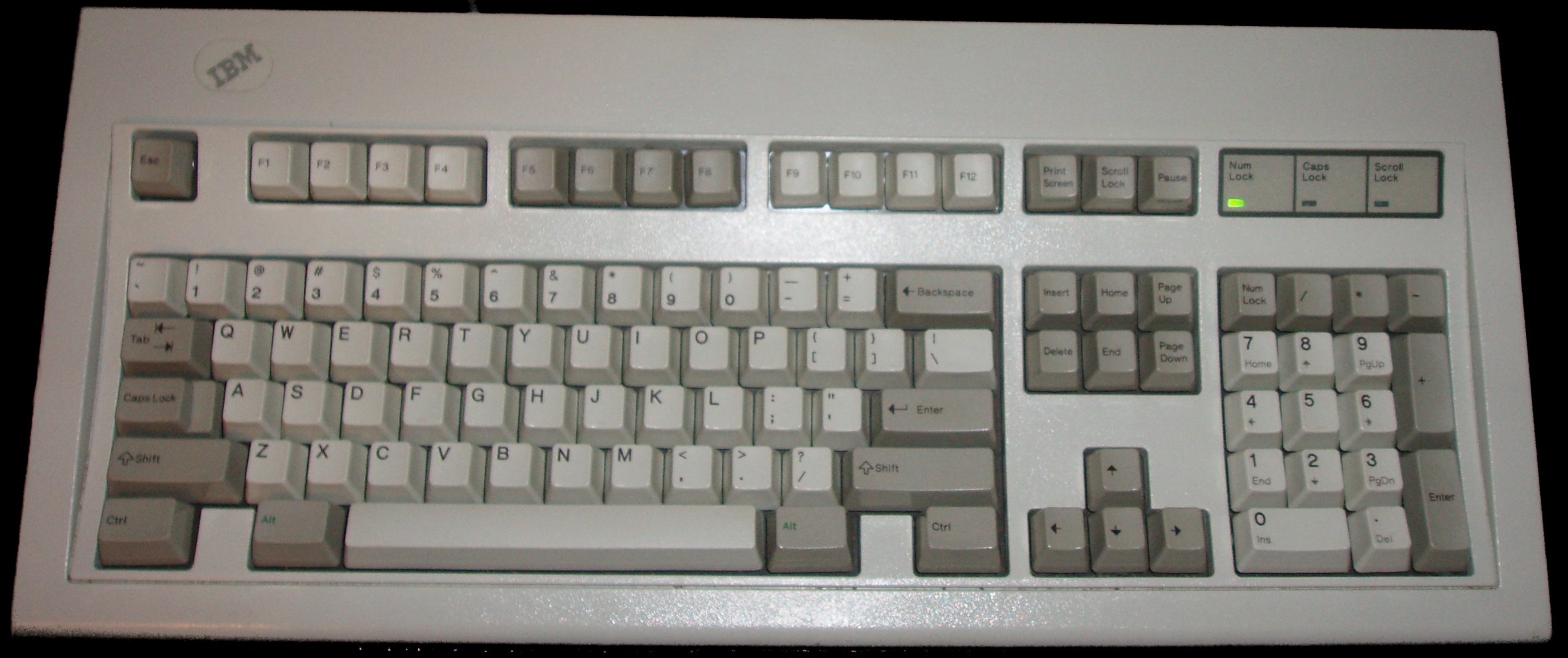
Oh wait, sorry, that’s the original 101-key version of the IBM PC Keyboard, introduced in 1985. How’d that get there? It’s been almost thirty years, so the CODE keyboard must be awesome, right?
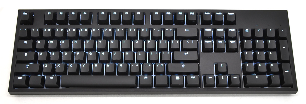
Hmmm. How can a truly great keyboard still have a “Scroll Lock” key? And what is that “Print Screen” key doing there?! It even comes with a PS/2 adapter!
Aesthetically, this keyboard doesn’t do anything for me. Between the haphazard typography and silly Windows “context menu” icon, I find it pretty ugly. And no Bluetooth.
Let’s look deeper at the design, though. What does it tell us? This design has been around for thirty years, and here’s what it has to say:
- Hitting “space” is the most important thing you could ever do.
- Caps Lock and Enter are pretty important and of equal importance - they are the second easiest keys to hit outside of the home keys.
- Letters are more important than numbers, as numbers are farther away from the home position.
- Control, Alt, “Meta”/Windows, and Shift are all more important than numbers (they are an equal distance away, but have much larger keys).
- Alt is the most important modifier - it’s right where your thumbs are, making it easy to hold down while typing other things.
- Tab and Backslash are of equal importance, and are more important than most keys.
- Print Screen, Scroll Lock, Pause, Home, End, Page Up, Page Down, Insert, Delete and the arrow keys are all of equal importance, but lesser than the alphanumerics and modifiers as they are set off to the right.
- Analphabetics like “!”, “%”, and “{“ are least important, because they require the shift key to enter. “+” and “~” are probably the least relevant of these, because they are the most difficult to type: you must use Shift and your pinky, and you have to stretch for them.
How much of this is actually true of writing prose? Of writing code? I would argue that very little of it is correct. At least on a Mac, the location of “Alt” (called “Command”) makes sense - it’s the modifier for keyboard shortcuts. On Windows, it’s “Control”, and requires pinky contortions (which might be why a lot of developers map Caps Lock to Control). Caps Lock has no place on any keyboard.
There haven’t been a ton of innovations in the world of text entry over the years (at least not for writing prose or code - it’s all been focused on text message). There’s a smattering of “ergonomic” keyboards some of which provide more “thumb keys”, but in general, this is the same keyboard that’s existed for the majority of our lives. Even alternate layouts like Dvorak keep most things they same - they just shuffle around the letters.
My personal favorite is the Apple keyboard, as it’s the same for external and laptop. It bears many similarities to the classic 101 key layout, but has evolved a bit:
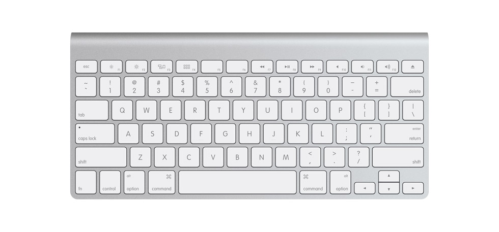
Here:
- Stupid keys like Page Up, Scroll Lock, and Insert are gone. They have no place in modern computing.
- Backslash is shrunk to its rightful size.
- Function keys are half-height to denote their unimportance, but are closer to the home position for ease of use (they also default to their alternate meanings - I’m much more likely to adjust volume than type F12).
- The arrow keys are still close at hand, but use half-height keys to signify their lack of importance.
This keyboard is classic Apple design in that it eliminates anachronistic features and is nice to look at.
But, it’s still basically the same keyboard as the CODE, which is the same keyboard that shipped with the first IBM PC.
A better writing keyboard
The current layout actually isn’t bad for writing prose (which isn’t surprising since it is an evolution of early mechanical keyboards). The letters are where you need them, with commas and periods close at hand.
The symbols next most-frequently needed are the exclamation mark, dash, and parenthesis. They are all ill-placed in this layout, being far away from the home keys, while more convenient locations are taken up by the rarely-needed caret, ampersand, and asterisk. I’d bump the parenthesis over one, putting the asterisk on the “0”, swap the exclamation mark with the ampersand, and finally, exchange the carat for the dash.
I’d also put the “Shift” key where “Alt” is (or perhaps divide up the space bar to allow shifting), because Shift is the most-needed modifier when writing. I could also see a case for having the right “Alt” be a different modifier to allow accented and other adorned characters.
Where things get interesting is when you consider writing source code.
A better coding keyboard
Famously, vi was developed on a computer using an ADM3A terminal, which had this keyboard:

Notice where the arrow keys are? Also notice what symbol is on the “Home” key? Finally, do you see how convenient the “@” key is to your right pinky (that’s the “execute macro” command in vi)? I find this fascinating.
The Chicken and The Egg
Here’s the keyboard of a Datapoint 3300, a terminal introduced in 1969 and could have easily been used in the development of the “B” programming language, a precursor to C:
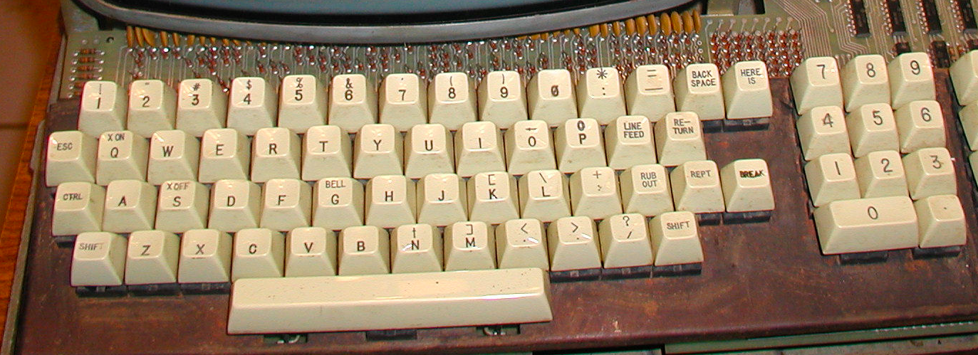
I’m not sure how one would enter curly-braces, but look at the positioning of keys for important symbols in C. The parenthesis are a bit more convienient, and the square brackets couldn’t be more at-hand, located as modified versions of M and K. Note also that “plus” is in a much nicer place—right under your pinky—while the asterisk is in a decent place for right-handers.
The 3300’s successor, the Datapoint 2200, has a bit of an odder layout, with the brackets and braces in a fairly strange position.
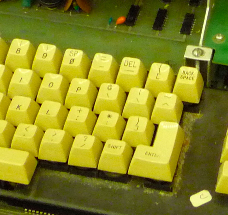
It’s hard to say if a keyboard influences language design or follows it. Here’s the layout of the IBM 3279 terminal, in use in the late 70’s, and you can be sure a lot of C code was written on this thing, just look at where the braces are!
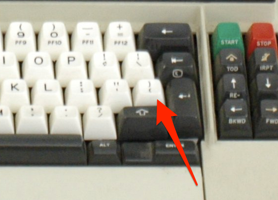
It’s actually perfect for a curly-brace language. The opening brace is a short right-pinky move away, with the closing brace merely requiring a shift - a very easy move for right-handers.
Further, notice how easy it is to get to the other important symbols. The ampersand and asterisk—symbols crucial for dealing with pointers—couldn’t be easier to access without displacing letters or numbers.
And here’s the keyboard of an early LISP machine:
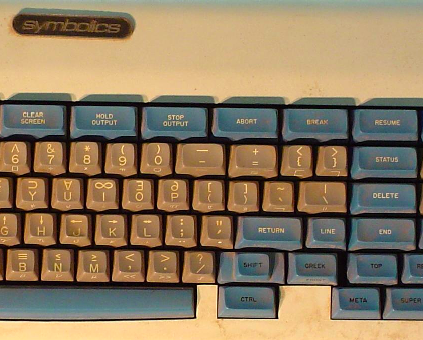
Notice how easy and juicy those parenthesis keys are (they are next to the “P” but also in their traditional location - the best of both worlds)? And given the importance of the single quote, notice how convenient it is? Of course, single quote has been in that place on a lot of old keyboards - perhaps it influenced the design of LISP? It’s hard to say.
What about modern languages?
A keyboard for modern languages
A front-end developer is probably tired of hitting “Shift” to create HTML tags and JavaScript functions, and has probably hit the “plus” key way too often in search of the more useful dash (often used in CSS class names).
For me, typing a plus sign is fraught with typos, as is reaching for the exclamation point with my left hand. In Ruby, a language that makes heavy use of the colon, I’m hitting “Shift” a lot, but the backslash key—much more rarely needed—couldn’t be more easy to get to. Further, Ruby uses snake_case (which requires the shift key to access the underscore), and relies on hashes (created by curly braces) much more frequently than most languages1.
So, do I need a Ruby keyboard? Would I even have enough fingers to use a Scala keyboard?
What would a programming language look like designed for our current thirty-year-old keyboard design?
A language for modern keyboards
- Perhaps carat is a better negation operator than the exclamation mark.
- Perhaps argument lists and collection literals would all use square brackets.
- Perhaps identifiers could have dashes in them.
- Perhaps symbols created with Command/Option modifiers would be useful - many of them would be easier to type than the “@” sign.
Could we even break some of our typing habits to use such a strange language?
I don’t have the answers, but I do know that a thirty-year-old keyboard design with mechanical switches and a Scroll Lock key isn’t what I’d call revolutionary.