Web Components in Earnest
January 24, 2024 📬 Get My Weekly Newsletter ☞
I’ve previously written about a basic experience with Web Components and not getting it, but I think I get it now. In this (quite long) post, I’m going to go over how I built Ghola, a palette generator for developers. It’s entirely built with custom elements. It has almost no dependencies, runs fast, and was fun to work on.
tl;dr
I used the custom elements API for this. I didn’t use templates, slots, or shadow DOM as they were not needed to achieve my goals (and I am less clear on why or how to properly use them). The style I chose to apply was so-called HTML Web Components where the custom element provides functionality related to the normal elements it contains. My custom elements do not render their own content.
What I found effective in using this API:
- Thinking of an element as enhancing its innards is much simpler than considering a full-fledged “component” that renders itself. It allows more flexibility and simpler code.
- Code defensively. The lifecycle methods like
connectedCallbackandattributeChangedCallbackcan be called at any time and in any order. - Handle failures and misuse silently…but provide optional debugging. The browser doesn’t complain if you put at
<li>inside a<dl>, so your elements shouldn’t either. But it’s nice to flip a switch to get a message that you may have screwed up. - Think of your element’s API as it would be documented on MDN: primarily attributes and events, with programmatic APIs supplementing only as needed.
- Centralize the element’s behavior into a single idempotent method that does whatever needs doing based on the current attributes and state. The lifecycle callbacks would then update state and trigger this centralized method (which can also be triggered programmatically).
There were a few surprising things I discovered:
- Utility CSS hits a limit when you need some dynamic behavior. Sometimes it’s way easier to write some CSS to target elements whose attributes are assigned dynamically, vs. dynamically assigning CSS based on an event handler.
- A browser-based testing workflow was far easier than a headless one or one that uses fake browser DOM via Node.
- The more I stuck to standard APIs—or mimicked them—the easier things were to understand. Thorny issues would often be resolved by re-thinking them in terms of HTML elements and standard behaviors.
There were some nice things, as well:
- I didn’t have to use
await,async, or any other artificially-introduced asynchronous behavior—since the browser’s APIs only use async when something actually is asynchronous. I used a promise only when previewing full screen, because that API uses promises. - My production dependencies are minimal. Very minimal
- My dev environment is simple and based on common UNIX tools.
esbuildis the only major tool I am using that’s not part of UNIX. - I opted out of the nightmare of JS testing and spent 300 lines on my own thing which works for me. It’s not refined or production ready but it solved my problem and allowed me avoid the nightmare of debugging Cypress tests for code that is actually working.
- By sticking to browser APIs, and mimicking them in my design, emergent properties and behaviors sprung up that allowed me to easily create features I hadn’t planned on and wouldn’t have spent time on if they took a lot of code.
All this is covered below, including some demos and examples.
The Deep Dive
This will go deep into the design and built of Ghola. You can view its source and run it locally if you like. I’m going to break this out into these parts:
- Overview of Components - this will show all the components that I created and give a general overview of what they do and how they work.
- Code Walkthrough - this will deep-dive into the actual code of the components to talk about tradeoffs, design issues, etc.
- Testing - my thoughts on testing and how I achieved this. Yes, I made my own (300-line) library because I just don’t have enough mental and emotional energy for Capybara, Cypress, and Playwright at the moment (or possibly ever again).
- Dev Environment - since this is an HTML and JavaScript app, the way HTML is generated is important, and this will describe the overall workflow I used when building the app. Spoiler: it’s mostly
makeand EJS. - Problems with my original attempt - The version of Ghola you can see on
ghola.devis the second attempt at using Web Components. The first one was focused more on making React-style components that render content and it did not go well.
Components of Ghola
Ghola is a way to make a color palette. This section will outline the basic terms I came up with and describe and demonstrate the custom elements. The code of those elements is discussed in the next section.
- Domain - terminology of Ghola
- Main Screen Elements
- Preview Screen Elements
- Saving State
Domain
- A palette is a set of one or more base colors, each with various shades
- The shades of a base color are brighter or darker versions of that base color, and this is a color scale.
- A color scale as a name for its base color, e.g. “Red”
- A palette has a primary color that drives the other colors.
- One scale’s base color can be derived from the primary color, e.g. its complement.
For example, consider this palette
- The primary color is
#B51A00, and is named “Red” - Orange is one of its analogous colors.
- Blue is its complement
- Purple is independently chosen
- Green is one of its triads.
If you change the primary color, the Orange, Blue, and Green colors will change accordingly.
With this domain set up, here are the custom elements.
Main Screen Custom Elements
Much of Ghola’s behavior was known to me ahead of time from my first attempt at making it, but I tried not to just recreate the same elements from the first time around.
I knew a few things before I started:
- Color inputs (
<input type=color>) would be used to select a primary color - Color swatches would exist to show a scale of darker and lighter colors.
- One swatch could be derived from another via algorithms like “complement” or “triad”.
- This derivation should be transitive: I wanted to have a swatch be the complement of a primary color and then derived colors of that complement show different shades
- I wanted all this to change in as real-time as possible, i.e. you pick a new primary color and everything updates.
I also knew I would need some sort of UI to add/remove colors, unlink a derived color (e.g. remove the derivation link between a complement so that if the primary changed, the old complement would remain). I also knew I’d want to be able to preview colors in a basic way and then make sure that permalinks to a palette would work.
Here is a shrunken-down picture of Ghola with the custom elements highlighted:
They are:
- Color Swatch - shows a color, possibly editable, possibly derived from another swatch
- Color Name - shows the color name, and allows changing it
- Palette Color Scale - the shades of a base color
- Palette - holds one or more Palette Color Scales
- Attribute Checkbox - sets or removes an attribute on another element when checked
- Add Color Scale Button - adds a color scale to the palette
- Download Palette - creates a programmatic/structured representation of the current palette
Note that most of Ghola is server-rendered from a single .html file. When you add colors, markup on the page is cloned, and this
is generally the only dynamic markup-generation that’s happening.
<g-color-swatch> Element
Custom elements must start with a letter and have one dash in them, so I prefixed all mine with g-. This seems logical because
as an app gets more complex, you may run into naming issues. Having some sort of namespacing seems wise.
The color swatch is the core to making everything work. The element wraps zero or more other elements and, depending on what’s inside, the custom element will add behaviors.
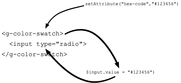
At it’s most basic, it allows choosing a color and reflecting that color back to a label inside the element:
The hex-code attribute will cause the input inside to receive it as its value. Additionally, a <code> element is added
inside the label and it’s textContent is the hex code itself. When the input is used, the new value replaces the custom
element’s hex-code value. When this happens, the hex-code-change event is dispatched.
The element need not contain form controls, however. The backgroundColor of any element with a data-color attribute will be
set to the value of hex-code. The hex code itself will be inserted into any element with the data-hexcode attribute:
<g-color-swatch hex-code="#334411">
  <div data-color
       style="width: 2rem; height: 2rem;">
  </div>
  <div data-hexcode
       style="font-family: mono">
  </div>
</g-color-swatch>
This second use case isn’t super compelling until we learn that hex-code can be omitted in favor of derived-from. If
derived-from is set, this is the id of another g-color-swatch whose hex-code is used as this element’s hex-code:
<g-color-swatch hex-code="#334411"
                id="primary">
  <label>
    <input type="color">
  </label>
</g-color-swatch>
<g-color-swatch derived-from="primary">
  <div data-color
       style="width: 2rem; height: 2rem;">
  </div>
  <div data-hexcode
       style="font-family: mono">
  </div>
</g-color-swatch>
Now, when the first <g-color-swatch>’s hex-code is changed, the second one is automatically updated. Meaning: the background
color of the first <div> will always reflect the color of the first swatch.
This is done almost entirely using browser APIS:
Try it out on CodePen:
See the Pen Editable Swatch and Mirroring by Dave Copeland (@davetron5000) on CodePen.
Still, this isn’t quite that interesting until we learn that derived swatches can show the derived-from swatch’s color modified
by a derivation algorithm, of which there are a few:
- brightness - used to make the different shades
- complement - to show the complementary color
- split-complement-upper and split-complement-lower - to show the split complementary colors
- analogous-upper and analogous-lower - to show the analogous colors
- triad-upper and triad-lower - to show the other colors in the triad.
These are specified via the derivation-algorithm attribute. If brightness is used, either a brighten-by or darken-by attribute is required to specify how much change should be done.
See the Pen Derived Swatches by Dave Copeland (@davetron5000) on CodePen.
Choose an algorithm, then change the color. The derived swatch will show the updated derivation. Note the JavaScript code here:
it’s just using browser APIs like setAttribute.
From this building block, much of the other behavior of Ghola can be created with only markup.
However, Ghola has to work a certain way. One part is to be able to name a color.
<g-color-name> Element
Since the palette is ultimately destined to be used in code, the color scales need names, like “Red”, “Gray”, or “Purple”. The color name component is how this is handled. By default, it will show a color name based on the hue of the related color swatch.
The <g-color-name> will find an input and set its value to the system-defined color of the swatch with the id given to
the color-swatch attribute.
<g-color-swatch hex-code="#334411" id="primary">
  <input type="color">
</g-color-swatch>
<g-color-name color-swatch="primary">
  <input type=text>
</g-color-name>
As you change the swatch, the input’s value is reflected with the correct system-defined name. But, if you edit the input,
this behavior will stop and the user-provided name is kept. And, if this happens, the input will have data-user-override set
on it, allowing you to change the styling.
Here is an example:
See the Pen Color Name by Dave Copeland (@davetron5000) on CodePen.
Note that if you modify the value, the italicized “(overridden)” label is shown. No JavaScript required!
Of note, this was the first point at which utility CSS didn’t quite work. One thing I like about utility CSS is when you do have
to apply it in code, it has nice benefits - you can see what behaviors are being added without taking a trip to a .css file.
element.classList.add("flex","flex-column")
Of course, not having to write any code is actually better. Even though a selector like label:has(input[data-user-override]) span is kinda gnarly, it’s better than writing JavaScript to detect when to apply or remove classes.
Now, with a swatch and a name, it’s possible to create a scale of various shades of a base color.
<g-palette-color-scale> Element
The color scale of the palette has a base color and then one or more shades darker and lighter. With raw HTML and the
<g-color-swatch> custom element, this can be done, but I wanted to have a simpler way of doing this. I wanted a custom element
to enhance other custom elements inside itself.
For example, I wanted to be able to say <g-palette-color-scale linked-to-primary="complement"> and have:
- the base swatch inside be
derived-fromwhatever the primary base color in the palette is. - have the other swatches show brighter and darker shades of the base.
And, I didn’t want to have to write JavaScript each time to set ids or manually tweak percentages of brightness.
I settled on three forms of this component:
<g-palette-color-scale primary>- this is used exactly once to indicate which scale contains the palette’s primary color.<g-palette-color-scale linked-to-primary="«link algorithm»">- this would set the base swatch to be linked to the primary based on the given algorithm, e.g. “triad” or “split-complement”.<g palette-color-scale>- this is an unlinked color that can change independently of the others.
Regardless of the form, each set of swatches inside would be modified to show a scale from dark to bright. There had to be an odd
number (so that the middle could be selected as the base). The brightness and darkness was governed by a scale-algorithm
attribute that could be linear or exponential. I always used exponential as this result in my desired set of shades, but
linear was easier to build as a test of the concept, so I left it in.
See the Pen Color Scales by Dave Copeland (@davetron5000) on CodePen.
This component also had support for the preview, remove, and unlink buttons:
- Preview, when clicked, would dispatch an event that could be listened for and given the scale’s hex values.
- Remove, when clicked, would remove the custom element from the DOM (as well as dispatch an event).
- Unlink, when clicked, would remove the attributes from itself so it was no longer derived from the primary. If the base color of this element was an input, that input would become enabled. An event was also dispatched in this case, too.
Like the other elements, if these buttons weren’t present, that was fine and this behavior just didn’t happen.
Now, from here the entire thing can be wrapped in a palette component.
<g-palette> Element
The palette component has three main responsibilities: first, it provides a programmatic way to add a new <g-palette-color-scale>.
Second, it provides programmatic access to the current state of the palette, i.e. what are all the hex codes, scales, and names.
Lastly, it handles launching the preview dialog.
The thorniest behavior is in adding a new scale, and this is the only component that generates significant markup dynamically. When asked to add a new scale, it copies the markup for the primary scale. It then modifies the ids within so that it is independent but still internally consistent. The fine details of this are discussed in the code walkthrough.
Scales are added, however, by the <g-add-color-scale-button>.
<g-add-color-scale-button> Element
This custom element wraps a button and takes over that button’s behavior. It listens for the button’s click and, when it happens, locates the palette with the id of its palette attribute, then programmatically asks it to add one or more new scales using the algorithm specified by its link-algorithm.
See the Pen Adding Color Scales by Dave Copeland (@davetron5000) on CodePen.
Notice in the CodePen that the markup for the button contains two <g-color-swatch> elements, derived from the base. They are showing the two
triads and, if you change the primary swatch, the button will change, too. I used this in Ghola’s UI to give a preview of what
would be added by those buttons.
This wasn’t a feature I planned, but it fell out of the design of the custom element. Since that element can be wrapped around
anything with a data-color element, it was trivial to add a nice bit of UI fun. Neat!
Ghola allows downloading the palette, too.
<g-download-palette> Element
This element wraps a link and intercepts its click event. When the link is clicked, it locates the palette specified by its
palette attribute, then uses a class based on its generator attribute. That class will implement blob() to return a blob
suitable for use in URL.createObjectURL().
This worked by asking the palette for all its color scales, and using the name and shades to produce the right values.
The last component you can see on the main screen is the checkbox that triggers compact mode.
<g-attribute-checkbox> Element
I tried very hard not to make generic, reusable components, because this usually involves more complexity than is needed. In this
case, however, it seemed easier to make it more generic. This component wraps a checkbox element and intercepts its state. It
accepts an element attribute, expected to be the id of another element, and an attribute-name attribute.
When the interior checkbox is checked, the element the id from element has the attributed named from attribute-name set to true. When the checkbox is unchecked, the attribute is removed.
I used this to add or remove the compact attribute to the <g-palette>, then drove the visual appearance of compact mode
entirely in CSS. This was far simpler to achieve than having each component modify its behavior or appearance programmatically.
As an interesting aside, this demonstrates a flaw in using nothing but utility-based CSS a la Tailwind, Tachyons, or my own MelangeCSS. The only reasonable way to achieve it without writing CSS would be to write JavaScript to add or remove classes programmatically. My initial attempt at Ghola did, in fact, do this, and it was highly complex.
There are a few more elements used for previewing.
Custom Elements for Previewing
I wanted to be able to preview a color scale so you could see how text would look and see basic color contrast calculations.
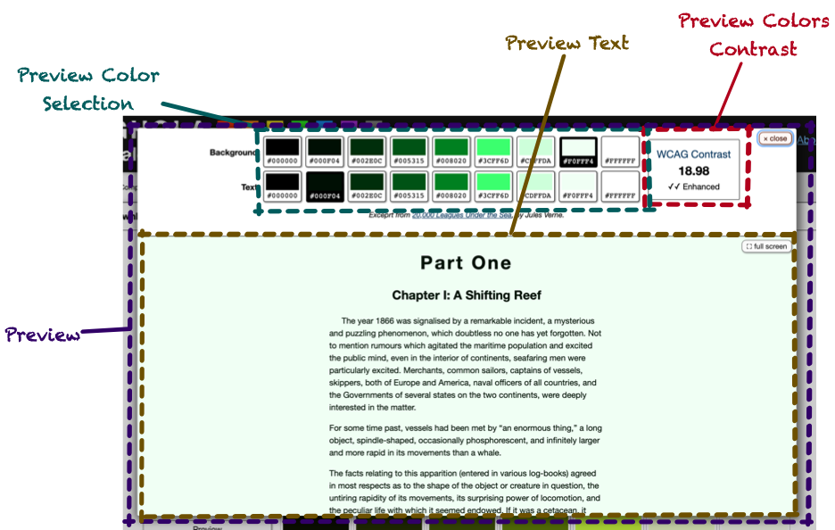
This was created with:
- Preview - Wraps the entire preview experience
- Preview Color Selection - radio buttons to choose the text and background colors.
- Preview Text - shows the text being previewed in the chosen colors.
- Preview Color Contrast - based on the chosen colors, show the WCAG contrast ratio, along with an indicator if it was not sufficient, minimally sufficient, or “enhanced”.
<g-preview> Element
This was pretty simple: it is programmatically given a color scale and passes it onto the components inside it.
<g-preview-color-selection> Element
This was a bit of a weird one, but it capitalized on how <g-color-swatch> worked. The markup would be two sets of radio buttons, one set for text and one for background. Each set would have one button for each hex code in the scale, plus one for black and another for white. In Ghola, this meant 9 total buttons in each set.
Since the value for hex-code is reflected in any input inside a <g-color-swatch>, the <g-preview-color-selection> could
iterate over the color swatches setting their hex codes to the values of the scale. The <g-color-swatch> elements, wrapping
radio buttons, would generate radio buttons whose value was the hex code.
This meant that if you listened for the radio button’s change event, event.target.value would be the hexcode, since
<g-color-swatch> would’ve set it. Meaning: these radio buttons can be used exactly as you would normally use a radio button,
without having to worry about the fact that they are enhanced by <g-color-swatch>.
The preview text and color contrast components could then listen for standard events from form elements.
<g-preview-text> Element
The preview text is hard-coded HTML (an excerpt from 20,000 Leagues Under the Sea), but it accepts text-color and background-color attributes that will set the color and backgroundColor styles accordingly. It also accepts a form attribute, which is the name of a form whose elements can cause the text-color and background-color to change.
The custom element then listened for a change event from any element inside the form. If the event came from an element whose
name was either text-color or background-color, it would update its own attributes to match. This would then cause the text
and background colors to change with the form.
Note that nothing about this has anything to do with Web Components or custom elements. Yet again, it’s just basic browser API stuff.
The contrast component works similarly.
<g-preview-colors-contrast> Element
This component works just like <g-preview-text>, but it calculates the WCAG contrast ratio between the two values. It looks for a
data-ratio element, and sets its textContent to the ratio. It then locates elements with attributes data-enhanced,
data-minimal, and data-insufficient, and shows or hides them based on the ratio.
Here’s a demo that doesn’t require additional JavaScript beyond what’s implementing the elements. Since the element gets its values from any named form that has text-color and
background-color, it can be paired with <g-color-swatch> elements and just work.
See the Pen Warnings in console by Dave Copeland (@davetron5000) on CodePen.
And with that, the app could be put together. All of the components described create the app, but that’s not all the code there is.
Saving State
I wanted the query string to be updated with whatever information was needed to allow permalinks to specific palettes. That meant including the hex code of the primary color, along with the hex code of any unlinked colors. It also meant including which linked algorithms were used and the names used, if the user had overridden them.
On the one hand, this is easy enough to do with the history API and pushState. But, knowing what the push and how to handle
popstate were more challenging.
First, there had to be an event for every change in the palette so that those events could trigger a pushState event. I handled
that by having the <g-palette> dispatch a palette-change event, and it would sort out what actions from the components it
wrapped constituted a palette-change. The event receiver could call methods on the custom element to access the palette’s values.
Trickier was what to do on a pop state, i.e. when a user hit the back button. I hate when web apps break the back button. But, to handle it without a page refresh would’ve required basically destroying the entire page and rebuilding it. This was tricky, so I ended up using the query string as the state and refreshing the page on back. Not perfect, but as long as GitHub Pages is fast enough, it should be OK.
With that out of the way, let’s look at some code!
Code Walkthrough
The simplest component to start to understand is <g-attribute-checkbox>. This will lead to some of the re-usable stuff I
extracted and see the overall structure that the other components also have.
I’m not putting a TOC for this section as you need to read the entire thing to see the evolution of the basic API to the (minimal) reusable code I ended up with.
<g-attribute-checkbox>
As a custom element that has custom attributes, the following code has to exist in some form:
class AttributeCheckboxComponent extends HTMLElement {

  static observedAttributes = [
    "element",
    "attribute-name",
    "show-warnings",
  ]

  connectedCallback() {
    // Called when added to DOM
  }

  attributeChangedCallback(name,newValue,oldValue) {
    // Called when attributes change, REGARDLESS
    // of connectedness.
  }

}
customElements.define("g-attribute-checkbox",
                      AttributeCheckboxComponent)
I eventually extracted a few patterns into a base class, but let’s see how this component works without that, so we can build up to what I did—and did not—abstract.
The tricky thing about custom elements is you can’t make that many assumptions about the state of the DOM, in particular when
attributeChangedCallback is called. You need to be very defensive and query for DOM elements only when it makes sense.
I did assume that my code would be run after DOMContentLoaded had dispatched. But, you can’t really assume that your attributes will
have been set, especially since they can change after the page is first rendered.
This means that code like this—which I have seen in a lot of tutorials—won’t necessarily work:
class AttributeCheckboxComponent extends HTMLElement {

  constructor() {
    super()
    this.element = document.getElementById(
      this.getAttribute("element")
    )
  }

}
Instead, you need to do something like this:
class AttributeCheckboxComponent extends HTMLElement {

  attributeChangedCallback(name,newValue,oldValue) {
    if (name == "element") {
      if (newValue) {
        this.element = document.getElementById(newValue)
      }
      else {
        this.element = null
      }
    }
  }
}
The checkbox also needs the value for attribute-name in order to actually do something. So, that leads to a somewhat complicated method like so:
attributeChangedCallback(name,newValue,oldValue) {
  if (name == "element") {
    this.elementId = newValue
  }
  else if (name == "attribute-name") {
    this.attributeName = newValue
  }
  if (this.attributeName && this.newValue) {
    const checkbox = this.querySelector("input[type=checkbox]")
    const element = document.getElementById(this.elementId)
    if (checkbox && element) {
      const update = () => {
        if (checkbox.checked) {
          element.setAttribute(this.attributeName,true)
        }
        else {
          element.removeAttribute(this.attributeName)
        }
      }
      checkbox.addEventListener("change", () => {
        update()
      })
    }
  }
}
This code is still a bit too naive. If attribute-name is changed, you’ll end up with a second event listener on the internal
checkbox, and you’ll set both the new attribute-name and the old one. And, if the checkbox is changed programmatically, this
won’t trigger the change event, so your checkbox and related element will be out of sync.
To deal with the multiple listener issue, I pulled the code into an instance variable. That way, subsequent calls to
addEventListener wouldn’t add more than one listener. The listener uses whatever element is set up and whatever attribute is
configured at the time the listener is called.
constructor() {
  super()
  this.checkboxChangeListener = (event) => {
    const element = document.getElementById(this.elementId)
    if (element && event.target.checked) {
      element.setAttribute(this.attributeName,true)
    }
    else {
      element.removeAttribute(this.attributeName)
    }
  }
}

attributeChangedCallback(name,newValue,oldValue) {
  if (name == "element") {
    this.elementId = newValue
  }
  else if (name == "attribute-name") {
    this.attributeName = newValue
  }
  const checkbox = this.querySelector("input[type=checkbox]")
  checkbox.addEventListener("change", this.checkboxChangeListener)
  this.checkboxChangeListener({ target: checkbox })
}
As you can see, attributeChangedCallback needs to invoke the logic of the listener, and it’s kinda janky to call the listener
by creating a fake event. So, I extracted the bulk of the logic into _updateElement():
constructor() {
  super()
  this.checkboxChangeListener = (event) => {
    this._updateElement()
  }
}

attributeChangedCallback(name,newValue,oldValue) {
  if (name == "element") {
    this.elementId = newValue
  }
  else if (name == "attribute-name") {
    this.attributeName = newValue
  }
  const checkbox = this.querySelector("input[type=checkbox]")
  checkbox.addEventListener("change", this.checkboxChangeListener)
  this._updateElement()
}

_updateElement() {
  const element = document.getElementById(this.elementId)
  if (element && event.target.checked) {
    element.setAttribute(this.attributeName,true)
  }
  else {
    element.removeAttribute(this.attributeName)
  }
}
To handle the issue of programmatic access, I wanted callers to be able to do element.check() or element.uncheck() and have
that check/uncheck the checkbox and then trigger the element’s logic.
What I realized would make this easier was a central method to execute whatever logic the element needed. Even though the element isn’t necessarily rendering its entire innards, I called the method render()
constructor() {
  super()
  this.checkboxChangeListener = (event) => {
    this._updateElement(event.target)
  }
}

connectedCallback() {
  this.render()
}

attributeChangedCallback(name,newValue,oldValue) {
  if (name == "element") {
    this.elementId = newValue
  }
  else if (name == "attribute-name") {
    this.attributeName = newValue
  }
  this.render()
}

render() {
  const checkbox = this.querySelector("input[type=checkbox]")
  checkbox.addEventListener("change", this.checkboxChangeListener)
  this._updateElement(checkbox)
}

_updateElement(checkbox) {
  const element = document.getElementById(this.elementId)
  if (element && checkbox.checked) {
    element.setAttribute(this.attributeName,true)
  }
  else {
    element.removeAttribute(this.attributeName)
  }
}
Then, check() and uncheck() could call render():
check() {
  const checkbox = this.querySelector("input[type=checkbox]")
  if (checkbox) {
    checkbox.checked = true
    this.render()
  }
}
uncheck() {
  const checkbox = this.querySelector("input[type=checkbox]")
  if (checkbox) {
    checkbox.checked = false
    this.render()
  }
}
This led to the basic design of all the custom elements:
connectedCallback()andattributeChangedCallback()would set up any internal state and callrender()render()would idempotently perform any logic, DOM updates, or other work needed to make the component work. It should always be safe to call at any time and should always behave properly, given the state of the element.
This proved to be much easier to do than trying to build smarts into each method to figure out what work needed doing based on the change or lifecycle activity that was triggered.
There were other patterns I was seeing across my components.
Disconnected Components Still Exist
I noticed that after a component disconnected, attributeChangedCallback could still be triggered. And, of course, any code with
access to the component could programmatically call methods on a disconnected component. Thus, it would handy if render would
not run after disconnectedCallback was called.
This led to this pattern:
disconnectedCallback() {
  this.disconnected = true
}

render() {
  if (this.disconnected) {
    return
  }
}
Next was the somewhat complicated call to define an element.
Defining the Element and Accessing its Tag Name
Even though customElements.define("g-color-name",ColorNameComponent) isn’t that bad, I did end up writing code like this.querySelector("g-color-name"). Since this duplicated the custom element names, it meant if I changed the element name, I had to hunt down all the query selectors.
I ended up standardizing on a static tagName attribute, so I could
do, instead, this.querySelector(ColorNameComponent.tagName). This also created a natural dependency in the JavaScript code
between components. Instead of getting null back, I’d get an error that tagName wasn’t defined.
With this tagName property, I created a static define() method:
static define() {
  customElements.define(this.tagName, this)
}
The last pattern I was seeing was messy attributeChangedCallback methods. They were basically a bunch of if statements. I
considered implementing attributeChangedCallback in a base class to just set property names directly, but that created a public
API for these properties that I didn’t want anyone to use. I realize that setAttribute("value",value) and element.value =
value do have different behavior in the built-in elements, but I didn’t want to make a public API out of every observed element.
Instead, I implemented attributeChangedCallback in a base class that deferred to subclass methods that conformed to a certain
convention.
One Base Class to Rule Them All
I called my base class BaseCustomElement to make it as obvious as I could what it was. Here is how
attributeChangedCallback looks:
attributeChangedCallback(name,oldValue,newValue) {
  const callbackName =
    `${new RichString(name).camelize()}ChangedCallback`
  if (this[callbackName]) {
    this[callbackName]({oldValue,newValue})
  }
  else if (
    this.constructor.observedAttributes.indexOf(name) != -1
  ) {
    console.warn(
      "Observing %s but no method named %s was found to handle it",
      name,callbackName)
  }
  this.__render()
}
RichString is a junk drawer class I keep around that, among other things, turns hex-code into hexCode. Thus, you can see
that attributeChangedCallback(name,oldValue,newValue) will call «attributeNameInCamelCase»ChangedCallback({oldValue,newValue}).
I retained ChangedCallback in the method name to make sure it was clear that this was related to the custom elements lifecycle method. I used named
parameters to allow the callback methods to opt out of oldValue, which I almost never needed.
This meant that attributeChangedCallback from AttributeCheckboxComponent could be removed in favor of these two methods:
attributeNameChangedCallback({newValue}) {
  this.attributeName = newValue
}

elementChangedCallback({newValue}) {
  if (newValue) {
    this.element = document.getElementById(newValue)
    if (this.isConnected && !this.element) {
      this.logger.warn(
        "No such element in the document with id '%s'",newValue
      )
    }
  }
  else {
    this.element = null
    this.checkbox.removeEventListener("change",
                                      this.checkboxChangeListener)
  }
}
(I’ll discuss this.logger.warn below)
BaseCustomElement also had the define() method, as well as implementations for connectedCallback() and
disconnectedCallback():
disconnectedCallback() {
  this.__disconnected = true
  this.__connected = false
  if (this.onDisconnected) {
    this.onDisconnected()
  }
}

connectedCallback() {
  this.__connected = true
  this.__disconnected = false
  if (this.onConnected) {
    this.onConnected()
  }
  this.__render()
}

get isConnected() { return !!this.__connected }
I didn’t super love preventing the subclasses from implementing the standard connectedCallback and disconnectedCallback methods, but this seemed the easiest way to set the flags needed to implement __render, like so:
__render() {
  if (this.__disconnected) {
    return
  }
  if (this.render) {
    this.render()
  }
}
Note that the double-underscores were there to remind me that they are private to BaseCustomElement. I’m not sure of a better
pattern.
With a centralized base class, I could also provide a way to manage warnings
Warnings, Silent Failure, and Debugging
As I mentioned, custom elements should not emit warnings or errors, and should be defensive. For example, if the
AttributeCheckboxComponent didn’t find a checkbox inside it, it should just not do anything (vs throwing exceptions).
That said, it’s nice for debugging to be told that you are using an element incorrectly.
I decided to manage this by looking for the attribute show-warnings. If this was set, the component could check this and emit
console messages if something was wrong or misused.
To avoid having tons of if (this.showWarnings) statements everywhere, BaseCustomElement would provide this.logger, which wrapped console.log. BaseCustomElement would implement showWarningsChangedCallback which, due to the implementation of attributeChangedCallback, would be called when show-warnings was set on the element (assuming the element’s subclass put it into observedAttributes)
The Logger would have the concept of a prefix that would be prepended to all messages, so you’d know what instance messages were coming from. The null prefix would mean “don’t log anything”, and would be the default behavior.
constructor() {
  super()
  this.logger = Logger.forPrefix(null)
}
If show-warnings was present on an element, either its value or the element’s id would be used for a prefix, triggering another
implementation of Logger that would actually output warnings:
showWarningsChangedCallback({oldValue,newValue}) {
  let oldLogger
  if (!oldValue && newValue) {
    oldLogger = this.logger
  }
  const prefix = newValue == "" ? this.id : newValue
  this.logger = Logger.forPrefix(prefix)
  if (oldLogger) {
    this.logger.dump(oldLogger)
  }
}
Note the last call to this.logger.dump. The “null” logger would retain its messages and dump them if logging was turned on after
the component was created. This happened if the attributeChangedCallback('show-warnings',…,…) was called after other attributes
were set, and those calls generated warnings.
Now, any element can check for warnings and not litter the console with them by default, but see them if needed.
Here’s an example where a <g-color-swatch> has no input or data-color. Open the JavaScript console to see the warnings.
See the Pen Editable Swatch and Mirroring by Dave Copeland (@davetron5000) on CodePen.
This code from AttributeCheckboxComponent demonstrates its use:
if (this.isConnected && !this.element) {
  this.logger.warn("No such element in the document with id '%s'",newValue)
}
If you had this markup:
<g-attribute-checkbox element="non-existent" show-warnings>
  <!- ... %>
</g-attribute-checkbox>
The warning will show up in the console. If you remove show-warnings, it goes away.
BaseCustomElement may seem like a lot, but it’s only 67 lines of code long, excluding comments. I namespaced it in the folder brutaldom as an ode to Brutalism, a style of architecture that adheres to “truth to materials”.

To me, the advantages of Web Components and custom elements is that you are using the browser’s API directly, not through some
leaky abstraction. While my BaseCustomElement is a form of abstraction, it takes great pains to make sure it’s very obvious what
it’s doing and how it works. Just like a lot of Brutalism.
With this base class in place, AttributeCheckboxComponent is pretty straightforward. And, if you don’t know what is in BaseCustomElement, but you do understand the custom elements API, you can have a pretty good guess what elementChangedCallback and tagName are doing.
Let’s jump even deeper and look at the code for the color swatch element, as this is the most complex.
<g-color-swatch>
As discussed above, the general API of this element is:
- Attributes
hex-code- The hex value to showderived-from- ID of another color swatch to use as the color, instead ofhex-codederivation-algorithm- the algorithm to derive our color from the other colordarken-by- Ifderivation-algorithmisbrightness, what % darker should we be?brighten-by- Ifderivation-algorithmisbrightness, what % brighter should we be?show-warnings- Should we show warnings (see above)?default-link-context- Is there additional context to show inside the element somewhere?
- Events
hex-code-change- dispatched if thehex-codeattribute was changed, which can happen when any innerinput’s value has changed, when a new value is derived, or someone callssetAttribute('hex-code',…)orremoveAttribute('hex-code')on us.
- Properties
hexCode- a getter that returns the current hex code. If this swatch is deriving its value from another swatch,hexCodewill return that value.
Let’s start with render which, as you recall, is responsible for doing whatever needs doing based on the element’s attributes
and contents.
First, it must connect its value to any input elements it finds inside itself. And, in order to provide a good warning when
show-warnings is set, it will warn if our value is derived from another, but an editable input is found, since this would create
confusing behavior:
render() {
  const numInputs = this._eachInput( (element) => {
    element.value = this.hexCode
    element.addEventListener("change",
                             this.onInputChangeCallback)
    const disabled = element.getAttributeNames().
                             indexOf("disabled") != -1
    if (!disabled) {
      if (this.derivedFromId) {
        this.logger.warn(
          "derived-from-id is set, but an enabled input was detected: %o",
          element)
      }
    }
  })
_eachInput exists to return the number of inputs found so we can give a warning:
_eachInput(f) {
  const elements = this.querySelectorAll("input")
  elements.forEach(f)
  return elements.length
}
Next, render must set the background color for any data-color elements. After that, it will warn if it didn’t find any inputs
or any data-color elements:
const numDataColors = this._eachDataColor( (element) => {
  element.style.backgroundColor = this.hexCode
})

if ( (numDataColors == 0) && (numInputs == 0) ) {
  this.logger.warn(
    "There were no <input type=color> nor [data-color] elements found"
  )
}
_eachDataColor looks like _eachInput:
_eachDataColor(f) {
  const elements = this.querySelectorAll("[data-color]")
  elements.forEach(f)
  return elements.length
}
Next, we set up the “link context”. This is where Ghola shows “Primary”, or “Complement” in the UI. The <g-color-swatch> has a
notion of a “default” link context to show if no linking algorithm is set. This is almost entirely used to show the label
“Primary”.
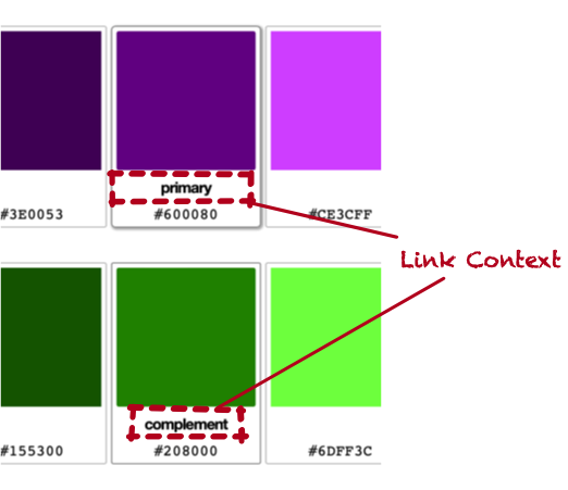
this._eachLinkContext( (element) => {
  if (this.defaultLinkContext) {
    element.textContent = this.defaultLinkContext
  }
  else {
    element.innerHTML = " "
  }
})
_eachLinkContext is just a single line, but exists to have parity with _eachDataColor and _eachInput:
_eachLinkContext(f) {
  this.querySelectorAll("[data-link-context]").forEach(f)
}
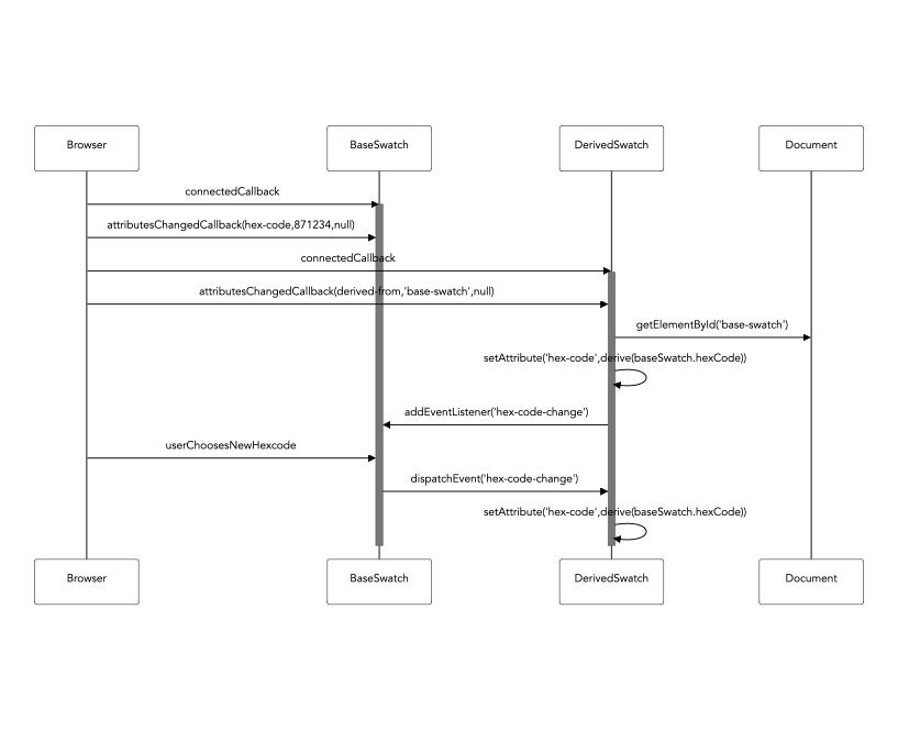
Next, we handle the situation when our value is derived from another. This was tricky to get right, especially in order to avoid an infinite loop.
if (this.derivedFromId) {
  this._updateDerivationifNeeded({ whenHexCodeExists: false })
}
_updateDerivationifNeeded is a bit gnarly. Basically, if we are deriving from another swatch, and the element is a
<g-color-swatch> and has a hexcode, update our derivation. There is a complication around the flag
whenHexCodeExists.
In some contexts, we don’t want to execute this code if we already have a hexCode value. render() is
such an occasion. This is because the derivation will ultimately call this.setAttribute("hex-code",…), which triggers render() and
thus an infinite loop.
That said, if darken-by, brighten-by, or derivation-algorithm change, we need to recalculate our hex code even if we already
have one. Whew! Here it is:
_updateDerivationifNeeded({whenHexCodeExists}) {
  const derivedFromElement = this.derivedFromElement
  const hexCodeExists = !!this.hexCode

  if (derivedFromElement) {

    if (derivedFromElement.tagName.toLowerCase() ==
        this.constructor.tagName) {

      derivedFromElement.addEventListener(
        this.hexCodeChangedEventName,
        this.onDerivedElementChangeCallback
      )

      if ( (derivedFromElement.hexCode) &&
           (whenHexCodeExists == hexCodeExists) ) {

        this._deriveHexCodeFrom(derivedFromElement.hexCode)

      }
      this._eachLinkContext( (element) => {
        element.textContent = this.derivationAlgorithm.humanName
      })
    }
    else {
      this.logger.warn(
        "Derived element has id '%s', but this is a %s, not a %s",
        this.derivedFromId,
        derivedFromElement.tagName,
        this.constructor.tagName)
    }
  }
}
Note that we warn if the derived ID is not a color swatch. In that case, the element should do nothing, but debugging this was difficult, so the warning was really helpful here when I got the ids wrong.
Also note that we override the “default link context” with the name of the derivation algorithm. This allows us to have a place for this information, and set a reasonable value if it’s not there.
_deriveHexCodeFrom looks like so:
_deriveHexCodeFrom(hexCode) {

  const darken   = this.darkenBy ?
                     parseInt(this.darkenBy) : null
  const brighten = this.brightenBy ?
                     parseInt(this.brightenBy) : null

  if (this.derivationAlgorithm) {
    hexCode = this.derivationAlgorithm.derive(
      hexCode,{darken: darken, brighten: brighten}
    )
  }
  this.setAttribute("hex-code",hexCode)
}
Where does this.derivationAlgorithm come from? That’s clearly not a string. It’s setup by BaseCustomElement’s
attributeChangedCallback, which will call derivationAlgorithmChangedCallback. It looks like so:
derivationAlgorithmChangedCallback({newValue}) {
  this.derivationAlgorithm = DerivationAlgorithm.fromString(
    newValue
  )

  if (this.derivationAlgorithm) {
    this._updateDerivationifNeeded({ whenHexCodeExists: true })
  }
  else if (!!newValue) {
    this.logger.warn("derivation-algorithm '%s' is not valid",
                     newValue)
  }
}
DerivationAlgorithm takes the string (which is the value of the derivation-algorithm attribute) and locates a class. Note that
if we find such a class, we call _updateDerivationifNeeded and tell it to do so even if we already have a hex code, since the
change in derivation algorithm likely means our hex code will change.
Here is an example of a derivation algorithm that derives the complementary color:
class ComplementaryDerivation extends BaseDerivation {
  derive(hexCode,options={}) {
    const [h,s,l] = this.hsl(hexCode)
    const newH = (h + 180) % 360
    return this.hexCode(newH,s,l)
  }
  get humanName() { return "Complement" }
}
The “H” in HSL is the hue, and it’s a value along a 360 degree circle. The complement is the value opposite of it on that circle.
OK, that is a deep dive, but render() is still not done! We have to put the hex code on any labels or data-hexcode elements.
We have to take care to clear out the value if we don’t have a hex code. This prevents an older value from sticking around if
the hex-code attribute was removed.
  if (this.hexCode) {
    this._eachCodeElementInsideRelevantLabel( (codeElement) => {
      codeElement.textContent = this.hexCode
    })
  }
  else {
    this._eachCodeElementInsideRelevantLabel( (codeElement) => {
      codeElement.textContent = ""
    })
  }
_eachCodeElementInsideRelevantLabel is quite long, because it must locate any label that is relevant, but not locate labels
that label other things. It also handles the data-hexcode case. In both cases, it looks for a code element. If it finds one,
that element’s textContent is set to the hexcode. This allows the hex code to be styled and placed precisely.
If there is no code element, one is created.
_eachCodeElementInsideRelevantLabel(f) {
  this.querySelectorAll("label").forEach( (label) => {
    let input
    if (label.htmlFor) {
      input = this.querySelector(
        `[id=${label.htmlFor}][type=color]`
      )
    }
    else {
      input = label.querySelector("input[type=color]")
    }
    if (input) {
      let code = label.querySelector("code")
      if (!code) {
        code = document.createElement("code")
        label.appendChild(code)
      }
      f(code)
    }
    else {
      this.logger.warn(`Orphaned label inside the element does not wrap nor reference a color input inside the element: %o`,label)
    }
  })
  this.querySelectorAll("[data-hexcode]").forEach( (hexCode) => {
    let code = hexCode.querySelector("code")
    if (!code) {
      code = document.createElement("code")
      hexCode.appendChild(code)
    }
    f(code)
  })
}
And that’s render. This covered most of the class, actually. Creating an idemopotent method to do whatever needs doing isn’t
always easy. One note is when the value of derived-from is changed
from the ID of an element to something else. That other element isn’t being removed from the DOM, so if we continue to listen to
its hex-code-change events, things will get confusing. So, we have to call removeEventListener:
derivedFromChangedCallback({newValue}) {
  if (this.derivedFromElement) {
    this.derivedFromElement.removeEventListener(
      this.hexCodeChangedEventName,
      this.onDerivedElementChangeCallback)
  }
  this.derivedFromId = newValue
}
Remember, this is called by BaseCustomElement’s attributeChangedCallback implementation. Also remember that
removeEventListener only works if you have the exact listener you provided. That means we have to hold onto the listener in
order to call this and it can’t be an anonymous function declared inside another method.
We set this up in the constructor and here’s what onDerivedElementChangeCallback looks like:
this.onDerivedElementChangeCallback = (event) => {
  if (event.target != this.derivedFromElement) {
    this.logger.warn("Got an event from not our derived")
  }
  this._deriveHexCodeFromSwatch(event.target)
}
You can tell that I initially forgot to removeEventListener and was pretty confused by what was happening. I put that if
statement in at first to try to debug where the events were being triggered from.
Note that I don’t need to do this when this element is disconnected, because in that case, the element is going away so the events being sent don’t really matter. But, I could’ve put some logic in BaseCustomElement to remove all event listeners.
Whew! That was a doozy, but a few themes are here that show up in all the other elements:
- Handle the presence and absence of values explicitly
- Be very careful when setting your own attributes, so you don’t create a cycle. Even without my
renderabstraction, it can be very easy to haveattributeChangedCallbacktrigger some code that callsthis.setAttribute, which will then callattributeChangedCallback. - Be very liberal handling whatever elements you find. You cannot require that your element contain other elements without having your element render itself. Instead, just do nothing if you can’t do anything. But provide a way to warn/debug.
- Be aware of listening for events from other elements. Just because you are being disconnected from the DOM doesn’t mean they won’t still dispatch events to you.
I’d also like to point out something very very nice about all this code. Do you see any Promises? Do you see the async or
await keywords? I sure don’t. It’s a nice place to be.
Let’s look at PaletteComponent next, because that’s the only component that did significant DOM manipulation and it was tricky in
the face of the way in which components are connected.
<g-palette>
I’m not going to go through the entire component, but as an overview, here is how it works:
- Attributes
show-warnings- Should we show warnings (see above)?save-state- if set, save state in the query string. This needs to be turned off when a test needs to use this component.
- Events
palette-change- Any time any part of the palette changed for any reason.
- Properties
primaryColor- returns the base hex code for the primary color, along with its name and a boolean flag that indicates if the user has overridden the name.otherColors- an array of objects likeprimaryColor, but instead of a hex code, the algorithm name is used when a color is linked to the primary.
- Methods
addScale({linkAlgorithm,hexCode})- adds a new scale to the palette. This is the method we’ll review here.
Let’s dig into addScale. This is called by a <g-add-color-scale-button> to add a linked or unlinked color to the palette. This
method basically needs to:
- Ensure there aren’t two colors linked by the same algorithm (e.g. only at most one complementary color is present)
- Clone the primary node
- Change any ids to ensure the new node is internally consistent and not referencing anything from the primary
- Trigger behavior after the element is added
- Set up listeners to the new scale’s events to know when to dispatch
palette-changeevents
Let’s take the first bit, up to cloning the primary:
addScale({linkAlgorithm=null,hexCode=null}={}) {
  const primary = this.primaryColorScale
  if (!primary) {
    this.logger.warn("Palette has no primary color scale, so there is no reference to duplicate when adding a new scale")
    return
  }

  if (linkAlgorithm &&
      this.querySelector(
        PaletteColorScaleComponent.tagName +
        `[linked-to-primary='${linkAlgorithm}']`
      )
  ) {
    return
  }
  const newScale = primary.cloneNode(true)
Even though Ghola always has a primary <g-palette-color-scale>, there’s no reason this code has to bake that assumption in, so it
exits early if we can’t find it. Next, we make sure that if we are creating a linked scale, that we don’t already have that one
set up. Then, we clone the primary node.
The primary node will be a <g-palette-color-scale>, and if we ask its tagName, that’s what we’ll see. But, crucially, if we
ask for its constructor.name, sometimes we’ll get HTMLElement, and not PaletteColorScaleComponent, which is the class it should be.
This was super weird to wrap my head around. Setting attributes at this point will trigger attributeChangedCallback. I had a
hard time recreating this in a CodePen, and I think it must be some sort of situation where the element had not yet been defined
when the code ran.
Still, the next bit gets odd. A feature of <g-palette-color-scale> is that it will generate an id for the base
<g-color-swatch> in order to connect the brighter/darker swatches to it. To force that to happen on a new node, we have to clear
the existing id. We also clear default-link-context which, on the primary is Primary.
If our new scale is using a link algorithm, we want to disable any color inputs in the cloned scale. This prevents the user from editing them, but allows editing to be re-enabled later, if the scale should be unlinked.
Lastly, we remove the derived-from element from all the new swatches, since <g-palette-color-scale> will set them to whatever
id it generates for the base color swatch:
const newScale = primary.cloneNode(true)
newScale.removeAttribute("primary")
newScale.baseColorSwatch.removeAttribute("id")
newScale.baseColorSwatch.removeAttribute("default-link-context")
if (linkAlgorithm) {
  newScale.baseColorSwatch.
    querySelectorAll("input[type=color]").
    forEach( (input) => {

      input.setAttribute("disabled",true)

  })
}
newScale.swatches.forEach( (swatch) => {
  swatch.removeAttribute("derived-from")
})

this.appendChild(newScale)
The next bit of code will set up the link between the primary and the new scale, if there is a link algorithm. If there’s not, it
will set hex-code directly, thus creating an unlinked scale. If no hex code was provided a random value is used:
if (linkAlgorithm) {
  newScale.baseColorSwatch.removeAttribute("hex-code")
  newScale.setAttribute("linked-to-primary",linkAlgorithm)
}
else {
  if (hexCode) {
    newScale.baseColorSwatch.setAttribute(
      "hex-code",
      hexCode
    )
  }
  else {
    newScale.baseColorSwatch.setAttribute(
      "hex-code",
      Color.random().hexCode()
    )
  }
}
Notice this comes after it’s been appended to the DOM. I am not sure if this is strictly required, but I definitely had some odd
behavior trying to set these attributes before the call to appendChild. I’m certain it’s because of something I am doing, but
given that the documentation around custom elements is not great, it’s hard to know what to expect, specifically.
Moving on, we need to reset the <g-color-name> component inside the cloned scale. After the clone, it’s still pointing to the
primary scale’s base color swatch and we want it to point to the new scale’s base color swatch.
newScale.querySelectorAll(ColorNameComponent.tagName).
  forEach( (colorName) => {
    if (colorName.getAttribute("color-swatch") ==
        primary.baseColorSwatch.id
    ) {
      colorName.setAttribute(
        "color-swatch",
        newScale.baseColorSwatch.id
      )
      colorName.restoreDefaultColorName()
    }
  })
Note the defensiveness of changing only the <g-color-name> that references the primary’s base color swatch.
Lastly, we dispatch a palette-change event and hook ourselves up to the newly-created scale’s events:
  this.dispatchEvent(new CustomEvent("palette-change",{ cancelable: false, bubbles: true }))
  this._addScaleEventListeners(newScale)
  return newScale
} // end of render()

_addScaleEventListeners(scale) {
  scale.addEventListener("base-color-changed", this.colorChangeEventListener)
  scale.addEventListener("unlink-from-primary", this.colorChangeEventListener)
  scale.addEventListener("remove-scale", this.colorChangeEventListener)
  scale.addEventListener("name-change", this.colorChangeEventListener)
  scale.addEventListener("name-cleared", this.colorChangeEventListener)
  scale.addEventListener("preview-scale", this.previewScaleEventListener)
}
I went through this to point out some potential complexity in dynamically generating custom elements that reference other elements. It’s extremely powerful to allow one element to connect to another, but when duplicating or cloning elements, great care must be taken to set all attributes—and any inside—to blank or updated values.
Another option would’ve been to use a template and clone from that. That operation could be wrapped in a method that accepted
parameters for all ids and attributes, so there’s no worry about resetting, changing, or overwriting any values. I chose not to do
this because it would’ve either duplicated the existing markup in the static index.html file or required the very first color
to be rendered dynamically and I didn’t want to do that.
Whew again! Despite the length of this post, if you go back and look at the code, it’s really not that complicated. Once you are oriented to the browser’s APIs and the way Ghola works from the user’s perspective, it’s not hard to follow along. There’s not a lot of odd metaprogramming, strange callbacks, async inception, or anything all that confusing.
That all said, I needed a way to test this.
Testing
My approach to writing code is to just get things working—even if by copy and paste or other terrible means—then clean it up. It separates the “how do I get this to work?” from “what’s the right way to use this?”. I had been just clicking around and making demo pages to verify my elements were working, but it was tiresome. I needed tests.
I cruised through the usual suspects of Playwright, Cypress, and Capybara. My heart just sank thinking about setting these tools up. They are just so painful to use. My experience—over many years of using them—is that a not-insignificant portion of my dev time would be figuring why the tests were failing on code that I could verify by-hand was working.
The core problem with these tools is that they don’t expose the browser APIs to test. They also come with convoluted build steps, brittle toolchains, and a hodge-podge of selector and assertion libraries, all written in some sort of pidgen English that never really makes sense to me.
There are unit-testing things like testing-framework that are pretty much the same pile of unstable tooling and broken abstractions, but then don’t even run in the browser where my code will run.
I don’t have a solution here, but yes, I made my own test framework that runs in the browser. It’s 300 lines of code, has almost no API and runs super fast. It’s not without issues, but here is how it works.
- Make an HTML page that will contain your test cases. Each test case is surrounded by a custom element named
<g-test-case>. It should have anid. - The custom element should contain a
<g-test-subject>which will contain all the markup available for your test. - Create a JavaScript file that brings in the function
testCase. - Call
testCasewith theidfrom<g-test-case>and a function. - The function will be given functions as arguments you can use to create tests. One of them is
test.
Here is the test for the <g-preview-text-component>.
First, the HTML:
<g-test-case id="preview-text-colors">
  <g-test-case-subject>
    <g-preview-text
      class="db"
      background-color="#000000"
      text-color="#ffffff">
        <h1>CHAPTER II</h1>
        <h2>A NOVEL PROPOSAL OF CAPTAIN NEMO’S</h2>
        <p class="p">
        On the 28th of February…
        </p>
        <p class="p">
        Captain Nemo…
        </p>
        <p class="p">
        “The Island of Ceylon…
        </p>
        <p class="p">
        “Certainly, Captain.”
        </p>
    </g-preview-text>
  </g-test-case-subject>
</g-test-case>
The test code starts off importing testCase:
import {
  testCase,
} from "../brutaldom/testing"
The basic design of what I created is that you pass a function to testCase. That function’s argument is an object that will be
filled in by the test framework. You would use named parameters to indicate which of the object’s keys—i.e. injected functions—you
need for your test.
When the function you pass to testCase is called, the following parameters will be passed, as keys in the single-object argument:
setup- use this to declare pre-test setupteardown- use this to declare post-test teardownconfidenceCheck- use this to check test pre-conditionstest- use this to write a testassert- does what you’d expectassertEqual- does what you’d expectassertNotEqual- does what you’d expect
The test case here doesn’t need confidenceCheck or assertNotEqual, so those are not listed as parameters.
testCase("preview-text-colors",
         ({setup,teardown,test,assert,assertEqual}) => {
setup expects a function that can be passed arguments in the same style as testCase. It can be passed:
subject- anHTMLElementof the<g-test-subject>(subject.tagNamewould beG-TEST-SUBJECT).require- a function that returns its argument or raises an error if the argument is null. Useful for blowing up when expected markup isn’t found.clone- callsrequireon its argument, then does acloneNode(true). Will explain the need for this in a minute.
Here is the setup:
setup( ({subject,require,clone}) => {
  const $previewText = clone(subject.children[0],"child")
  document.body.appendChild($previewText)
  return ({$previewText})
})
Most setup calls look something like this. The test could operate directly on the markup in the HTML file, but it’s often handy to make a copy and test on that, so you have a clean place to start. I’m sure this could be genericized, but I didn’t do that. Instead, setup uses clone to copy the first child of its subject, in this case the g-preview-text element that’s going to be
tested.
It’s then added to the body. The return value of setup’s function is important. Whatever is returned is passed into the
function given to test (as well as to confidenceCheck and teardown). Here is teardown:
teardown( ({$previewText}) => {
  document.body.removeChild($previewText)
})
Because the function given to setup returned {$previewText}, that is available to the function given to teardown (which removes the node from the document).
Now, let’s look at a test.
In this case, there’s no action, because the test is assuming the attributes set in the HTML are what they are, so it’s checking that those attributes flowed through to the style:
test("the attributes flow to the styles",
  ({$previewText}) => {
    assertEqual("rgb(0, 0, 0)",$previewText.style.backgroundColor)
    assertEqual("rgb(255, 255, 255)",$previewText.style.color)
  }
)
Other than assertEqual, this is using the browser’s API. There’s no selector framework to hunt down, no lectures about how to
locate elements in some morally-pure way, no DSL to hope is documented and updated. Just the browser’s API which a) you are
already using and b) is how these components are used in the real world.
Next, we test that if the attributes are removed, the component uses reasonable defaults:
test("removing the attributes sets reasonable defaults",
  ({$previewText}) => {
    $previewText.removeAttribute("background-color")
    $previewText.removeAttribute("text-color")
    assertEqual("transparent",$previewText.style.backgroundColor)
    assertEqual("currentcolor",$previewText.style.color)
  }
)
Note also that because we are using the browser’s API inside a browser, we don’t have to put async everywhere. We have no
artificially-created promises to wait on or any other nonsense.
The way the tests work is that test stores the function into a global data structure, then a test runner runs all the functions that were stored. assert and
friends raise special errors to indicate test failure. This is all collated and reported in the console. I was already in the
console a lot building this, so that was a nice place to show the output.
You can run the tests yourself by going to the components page. Click on any of the “Run Tests” links and open up the console.
The other nice thing is that the markup is right there. You can interact with the exact test case to see why something isn’t
working (or comment out your removeChild to leave the test markup hanging around). This is way nicer than hoping headless
Chrome takes a screenshot or records a video.
It also means you can, you know, see the HTML of your test when things go wrong. That none of the browser-based testing frameworks do this by default (and most don’t make it easy) is baffling to me. The HTML is the input to these tests and it’s too difficult to view on a failure.
I did add two quality-of-life features:
- If the
<g-test-case>’s child is a<details>, it will open the element on a failure, but leave it closed on a pass. This lets you see instantly which test failed and play around with it. - I also created a custom element to view the source code of an element, and used that in the test case HTML. If you open up on of the test case summaries, you can see the source code that was input to the test. This saved me a few trips to the Elements tab in the dev tools.
It’s also very fast. I could change a file, then reload the page and see new tests run or updated tests run. We’ll talk about the dev environment later, but the cycle was fast. I was able to drive some features via TDD using this system pretty well.
This wasn’t all amazing, but I resisted the urge to polish this up. It has some warts:
cloneNoderequires careful rewriting/changing of anyidsused to connect elements. This isn’t always easy to do.- It would be nice to see results in the web page.
- The only way to run the tests is to go to a web page, which isn’t great for continuous delivery.
- It’s potentially brittle having an HTML page and the JavaScript tightly coupled but not co-located.
- Creating a new test requires a lot of copy/paste.
- This might not be great for testing higher-level workflows. Ghola’s main UI is not tested.
For this project, I was happy to not have to set up whatever JavaScript browser testing framework is popular today.
Extremely happy. But brutaldom/testing is pretty rough around the edges. Still, it accomplished its goal and served me well.
I wish more testing frameworks allowed us to use the browser directly without lectures or DSLs or leaky abstractions.
querySelectorAll works great, and to be honest, I would rather see assert(element.textContent.match(/foo/)) than
expect(element).toHaveText("foo").
I do think what I have built could be adapted to a CD workflow if it output the results into the webpage in structured markup that a secondary process could parse. A headless browser could launch the test page, wait for an element indicating test completion, then examine the results.
OK, what about the dev environment?
Dev Environment
The dev environment had to be reliable and stable. Other than depending on Docker, the app has very few dependencies and makes use of core UNIX tools and behaviors that have been encased in carbonite for the last 20 or 30 years. Reliable.
While Docker isn’t as repeatable as they’d like you to think it is, it’s far easier to come
back to a Docker-based dev environment later. I have a repo named DevBox that is the
basis for all the dev environments I’ve used in the past couple years. It copies itself into your project, so if you look at
dx, you can see the scripts used to manage everything.
dx/buildwill build a Docker image in which development will happen.dx/startwill start the dev environmentdx/execwill run commands inside the dev environment. You can certainly dodx/exec bashto “log in”, but you can also run any command this way.
The dev workflow is managed by a Makefile and the scripts in bin.
Dev Workflow
Examine package.json. It’s pretty minimal. The app itself has
only two dependencies:
colorConvert, which is a small library I’m using to convert hex to HSL, etc.melange-css, a utility-first CSS framework I created that works like Tachyons and, unlike Tailwind, has no annoying build step.
That’s it! The beauty of using built-in APIs. These dependencies will be reliable and, worst case, I can inline them into the app (I used a library called html-prettify to format the HTML and basically inlined the functions I needed, since the module did not look maintained).
The dev dependencies are also minimal:
http-serverto run the app locallyesbuildto package the CSS and JavaScript. I realize importmaps are a thing, but I don’t really understand how they work to be comfortable with my app making a bunch of flaky network calls to get its code.esbuilddoesn’t require configuration, runs quickly, and seems stable.ejsto generate HTML. Yup, good ‘ole EJS. Check outsrc/html/templates/head.htmlfor an example. This file is<%- includeed at the top of other files to share this stuff. Super basic. Any time I needed to re-use complex markup, I could do this. The build step for the app usesnpx ejsto produce fully-formed HTML files.chokidar-cliis used to auto-run the build step when files change.
My goal with this dev environment was to be able to run a command and have it detect changed files, then rebuild what was necessary. I could then save my work and reload the browser.
Many JavaScript toolchains cannot do this and just rebuild everything, hoping they are fast enough to do so. I decided to use a
tool that was built for this job decades ago: make.
Oh make
If you haven’t used make, it is a tool that allows you to specify dependencies between source and destination files, and provide
commands to make a destination from a source. Here are two examples.
First, we have the way to build our JavaScript using esbuild. Earlier in the file JS_DEST_FILE is defined as site/dev/js/main.js and JS_SRC_FILES are defined as all the *.js files in src/js. JS_SRC_FILE (no plural) is src/js/index.js, which is what we input to esbuild (it uses import to bring in the other files as esbuild doesn’t need to know which specific file changed). MINIFY_JS_FLAG is defined as empty for a dev build, but --minify --keep-names for a production build.
$(JS_DEST_FILE) : $(JS_SRC_FILES)
	npx esbuild $(MINIFY_JS_FLAG) --sourcemap \
                    --bundle $(JS_SRC_FILE) \
                    --outfile=$@
Make is quirky, for sure. The space before npx has to be a tab. $@ represents the thing on the left-hand side of the colon. But, like any system, you can learn this stuff easily enough (or, more realistically, learn how to quickly navigate its extensive documentation).
What this code does is allow me to execute make site/dev/js/main.js. If any of the files in JS_SRC_FILES are newer than
site/dev/js/main.js, the npx esbuild command is executed. But, if site/dev/js/main.js is actually newer, nothing is
executed. Meaning: I can basically run that in a loop and it will only do something if there is something to do.
Here is another example for the HTML. In this example, HTML_DEST_DIR is site/dev/, HTML_SRC_DIR is src/html, and
EJS_DATA_FILE is ejs_data_file.dev.json.
$(HTML_DEST_DIR)/%.html: $(HTML_SRC_DIR)/%.html
	@mkdir -p `dirname $@`
	npx ejs --data-file $(EJS_DATA_FILE) \
        --output-file $@ $<
Yes, even more weird symbols. The @ in front of mkdir prevents make from printing out the command when it’s run. The $<
represents the file on right-hand side of the colon. The reason for these indirections is that the rule—the first line with the
colon in it—is itself a template rule.
It is saying that if I want to build a file in site/dev, and there is a file with the same name in src/html that is newer,
execute this command. Essentially, this is a script for using EJS to build a destination file from a source file.
To bring this together, we might do this:
default: $(JS_DEST_FILE) $(HTML_DEST_FILES)
	@echo Done with $(ENV)
When I run make default, make will execute the rules for JS_DEST_FILE (which is site/dev/main.js) and HTML_DEST_FILES
(which are all the files found in src/html except renamed to be in the site/dev folder. make will then build only what
files are out of date.
This means that my build step is basically make default (or, simply make because default is the last rule in the file), and
make will build only what files have changed, i.e. perform an incremental build.
Because this needs to work for dev and for production, I wrapped a few details into
bin/build. So I can run dx/exec bin/build and build whatever is
needed for dev, or do dx/exec bin/build production to build for production.
Now Draw the Result of the Dev Workflow
The Makefile is the core logic of my dev workflow, but we also need to run a web server and, ideally, automatically rebuild
everything when any file changes. bin/run handles running the web
server, and it can run for dev or production (since this is hosted on GitHub Pages, that means running out of docs/).
bin/dev brings both bin/run and bin/build together. It uses
Chokidar to run bin/build if any file in src has changed:
SHELL=/bin/bash npx chokidar -p "src/**/*" -c "bin/build"
It runs this in the background, then runs bin/run also in the background, then calls wait which will sit there as long as
both commands are running. If you control-C bin/dev, the trap killgroup SIGINT causes the killgroup function to be called,
and this kills both bin/run and Chokidar.
This means that I can do dx/exec bin/dev and my app is rebuilt as I save files.
Look at the Makefile and the scripts. There is really not that much there. It’s all using basic UNIX tools that have existed
for decades for the most part. EJS, esbuild, and Chokidar have been around and are stable. This is a set-and-forget setup.
Thus, the steps to go from zero to running this app in dev are:
- Install Docker
dx/builddx/startdx/exec bin/setupdx/exec bin/dev
You can try this out yourself by using tleilax as a template repo.
I should also point out that this is all my second time building Ghola with Web Components. My first attempt didn’t work as well.
My First Attempt
I did attempt Ghola with custom elements prior to this. My approach was to build React-style components that rendered themselves.
Each component had a <template> it would run, and a rich programmatic interface. It was complex. Here is the color
swatch component. You’ll
note that it mixes in several modules to re-use what ended up being common functionality.
HasAttributes requires that you define a
special object in your class, and then it will declare observedAttributes and override attributeChangedCallback to set the
values on the object. If you mix this in, you can intercept attribute assignment by overriding a setter, e.g. set hexCode(hexCode) The mixin also supported wrapping the strings in types.
HasEvents was my attempt to provide a
richer API than addEventListener. It is annoying to do string-based stuff with the browser API, but I’m not sure what I did is
the best way to solve for that. You’ll note that a lot of this particular mixin uses
MethodMeasurement.
I created MethodMeasurement to help figure out why Ghola v1 was so freaking slow. This version is
availble and you will note that it’s slower, especially if you add more swatches. If you are using
Safari, the color input sends realtime change events when you mess around in the color wheel. In this original version of Ghola, the browser just dies for a while before catching up. The revised version does not.
Seeing this slowness, I figured this was a good chance to dig into the performance API to try to figure out what was going on. I
got a lot of insights into stuff, but I never could figure out why it was so slow. The web of event listeners made it hard to
track down and the abstractions I had added around it made it even harder. That could be why I resisted creating an API on top of
addEventListener for the revision.
Lastly, you can see what I created to provide a programmatic interface for hiding and showing elements.
Hideable is a monstrosity. Instead of using
CSS for this, I had elements listen for the compact checkbox’s change event, then call element.show() or element.hide().
The problem, as you can see in the _displayValueWhenShown method is that if an element is hidden by default, the JavaScript code
needs to know what value for display to give it so that it works in the design. To use Hideable, your element must declare
data-brutaldom-display to have that value. Ugh.
I will say that this version of Ghola does work - it does create shades and links colors, just like the revision does. The reason I started over was the performance. I decided that even if the app worked, it should be fast. It was fast when I was prototyping, so something I had done was making it slower. But I couldn’t figure out what.
So, I started over from scratch, hoping that a simpler design would be easier to understand. Maybe the revised Ghola is slow on an older or cheaper computer, but it’s way faster than the original. So I never dug into its performance. If I have to, hopefully it will be straightforward.
This was an insight about using frameworks like React or Angular. They create complex abstractions on top of the browser and when you need to understand why your front-end is so slow, it becomes really hard to do that. JavaScript’s nature makes this a generally hard problem because of source maps, callbacks, and a lack of introspection into the runtime. The dev tools performance features may seem good, but they are incredibly hard to use and helpful documentation is scant. Add a complex set of dependencies on top of that, and it’s no wonder most SPAs are incredibly slow.
Outlook
The custom element API did feel like an upgrade over the plain browser API. Being able to use the lifecycle hooks instead of inventing my own is nice. When I had to add dynamic content, it was really nice not to have to bootstrap it: I added my elements and they just worked.
Thinking in terms of making my own elements that behaved as if they were part of the browser was a useful lens in designing them. It kept the public behavior and API of the elements simple—or at least simple enough.
While working on the app, it was nice to be able to reference the browser’s API for anything I needed. I’m not saying I didn’t hit Stack Overflow several times, but I never once had to chase down issues with some version of something I was using or worry that I was using the wrong approach that just happened to be the right approach years before.
Obviously, Ghola is a tiny, simple app. Who knows how this works in a larger, more complex setting. I do know that both Angular and React are not nice to use in a large, complex setting. They are quite painful and produce an unpleasant user experience, at least based on the apps I have used or worked on.
I can’t speak to approaches like Hotwire, except to say that the authors of Hotwire make highly dynamic JavaScript apps that I would also not say are particularly fast or well-performing. They aren’t bad at all. They are fine. Maybe they have to be that way. Or maybe there’s a future where we can do better with the APIs provided by the browser.