Learn Graphviz and Up Your Diagramming Game
December 08, 2016 📬 Get My Weekly Newsletter ☞
Learning to write is one of the best skills you can learn as a developer. It takes up an entire chapter in my book on being a great software engineer. Writing is a specific way to communicate ideas, but diagramming is a powerful tool as well, often moreso.
Being able to quickly create a diagram can make all the difference in expressing yourself clearly. And Graphviz is a great tool to have in your pocket to do so.
Graphviz is an amazing piece of technology. It takes, as input, a text file and produces a diagram of that input. It treats everything as a graph, but this is sufficient semantics to create most software diagrams you might need.
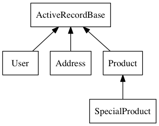
Here’s an example that shows a class hierarchy:
digraph classes {
  rankdir=BT
  node[shape=record]

  User           -> ActiveRecordBase
  Address        -> ActiveRecordBase
  Product        -> ActiveRecordBase
  SpecialProduct -> Product
}
Running dot -Tpng -oclasses.png classes.dot produces:
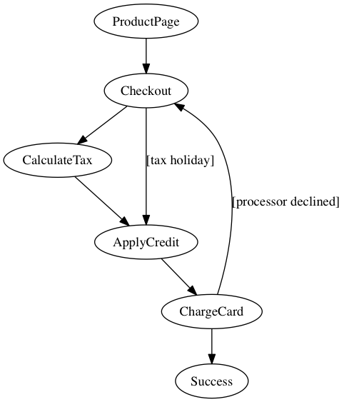
Graphviz can handle highly complex information. Suppose you wish to diagram a complex user flow for an online checkout.
digraph checkout {
  ProductPage  -> Checkout
  Checkout     -> CalculateTax
  Checkout     -> ApplyCredit [label="[tax holiday]"]
  CalculateTax -> ApplyCredit
  ApplyCredit  -> ChargeCard
  ChargeCard   -> Checkout [label="[processor declined]"]
  ChargeCard   -> Success
}
Running dot -Tpng -ocheckout.png checkout.dot produces:
Typing out that checkout flow would be a bear. Sometimes, it’s easier to do in a diagram. Creating this diagram in a tool like OmniGraffle wouldn’t be too bad but it would still be cumbersome. You’d also get lost in fonts, lines, and arrangement.
Begin able to quickly create a diagram like this reduces friction between your ideas and their expression to others.
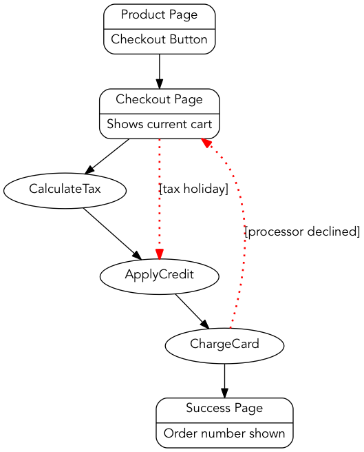
Beyond figuring out how to layout a diagram, Graphviz allows you to highly customize the output. Suppose you want a better font. Or maybe you want the actions happening on a webpage to be boxes and not ovals. Or you want the exceptional flows to be bright red dotted lines. Graphviz has you covered.
digraph checkout {
  node[fontname="Avenir"]
  edge[fontname="Avenir"]

  ProductPage  -> Checkout
  Checkout     -> CalculateTax
  Checkout     -> ApplyCredit [label="[tax holiday]"
                               color=red
                               penwidth=2
                               style=dotted]
  CalculateTax -> ApplyCredit
  ApplyCredit  -> ChargeCard
  ChargeCard   -> Checkout [label="[processor declined]"
                            color=red
                            penwidth=2
                            style=dotted]
  ChargeCard   -> Success

  ProductPage [ shape=Mrecord
                label="{<f0> Product Page| <f1> Checkout Button}"]
  Checkout    [ shape=Mrecord
                label="{<f0> Checkout Page | <f1> Shows current cart}"]
  Success     [ shape=Mrecord
                label="{<f0> Success Page| <h1> Order number shown }"]
}
Produces:
The language is called DOT and it may seem archaic, but it’s quite powerful.
DOT has a formal specification, but I find it easier to start with a simple example (like the diagrams here) and then tweak it by using the attributes reference.
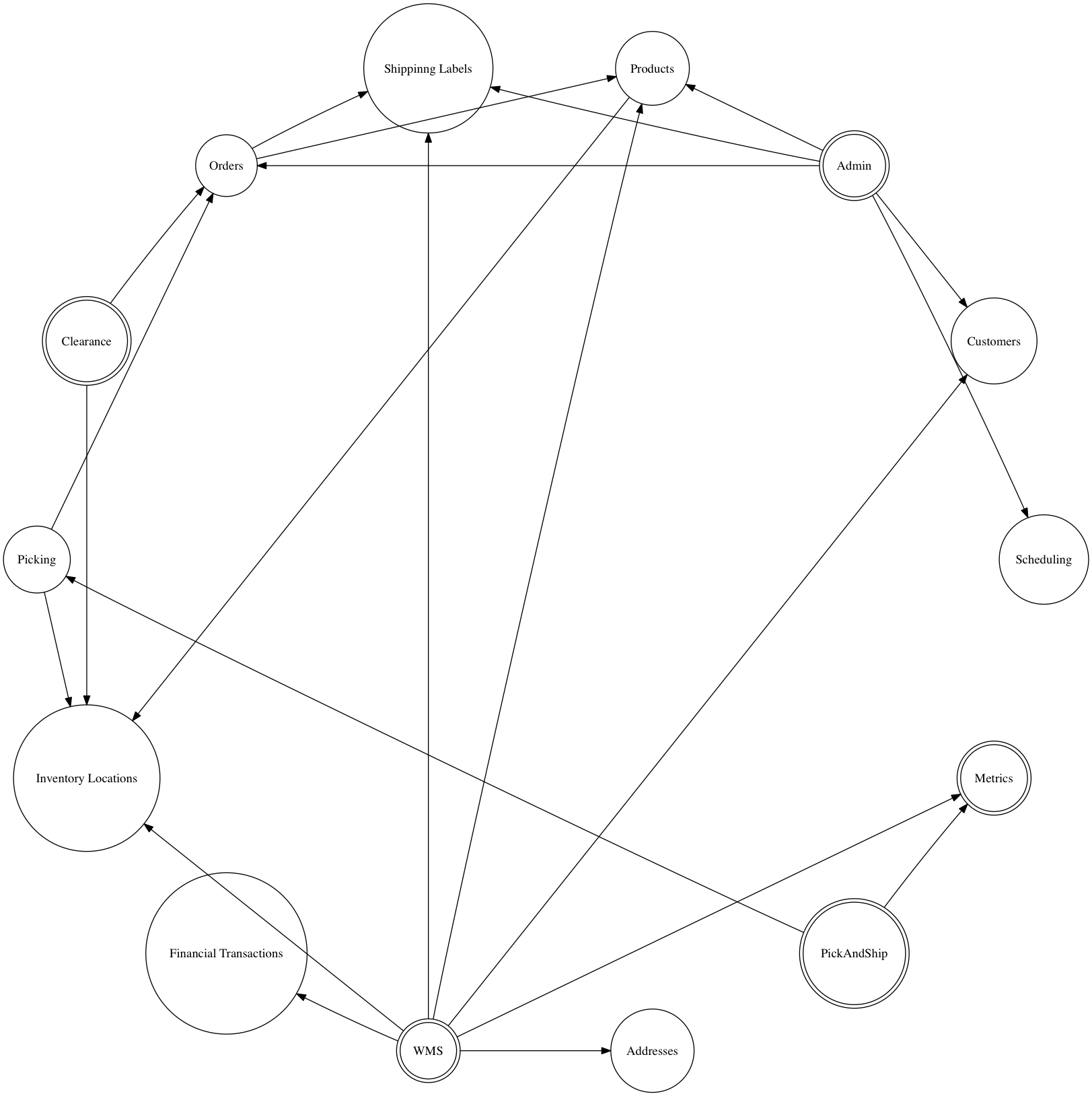
Next time you are having trouble expressing an idea, try a diagram, and try Graphviz. I’ll leave you with an example of using Graphviz to draw a “death star” microservices architecture diagram.
In this diagram, any service that is dependent upon another is connected, and we use the circo layout to arrange things radially. We further hack the graph to lay out all services in a circle.
digraph g1 {
  // Use the radial layout instead
  // of the hierarchical one
  layout="circo";

  // The meat: these are the dependencies between
  // applications and services
  WMS -> InvLocService
  WMS -> CustomerService
  WMS -> ShippingLabels
  WMS -> ProductService
  WMS -> Checkout
  WMS -> Metrics
  WMS -> AddressService

  Clearance -> OrderService
  Clearance -> InvLocService
  PickAndShip -> PickingService
  PickAndShip -> Metrics
  PickingService -> OrderService
  PickingService -> InvLocService

  Admin -> SchedulingService
  Admin -> OrderService
  Admin -> ShippingLabels
  Admin -> ProductService
  Admin -> CustomerService

  OrderService -> ProductService
  OrderService -> ShippingLabels
  ProductService -> InvLocService

  // This forces a circular layout.
  // The "penwidth" and "arrowhead" settings
  // at the end of this ensure these
  // edges won't be visible.  But, they
  // will ensure the services are arranged
  // in a circle
  WMS ->
    Checkout ->
    InvLocService ->
    AddressService ->
    Metrics ->
    PickAndShip ->
    PickingService ->
    Clearance ->
    OrderService ->
    ShippingLabels ->
    Admin ->
    SchedulingService ->
    CustomerService ->
    ProductService -> WMS [penwidth=0 arrowhead=none];

  // Now, configure visuals for the apps and services.
  // We'll have the user-facing apps use a double circle
  // and the headless services use a single one

  WMS               [ shape=doublecircle];
  Clearance         [ shape=doublecircle];
  PickAndShip       [ shape=doublecircle];
  Admin             [ shape=doublecircle];
  Metrics           [ shape=doublecircle];

  InvLocService     [ shape=circle label="Inventory Locations"];
  PickingService    [ shape=circle label="Picking"];
  Checkout          [ shape=circle label="Financial Transactions"];
  OrderService      [ shape=circle label="Orders"];
  ShippingLabels    [ shape=circle label="Shippinng Labels"];
  SchedulingService [ shape=circle label="Scheduling"];
  CustomerService   [ shape=circle label="Customers"];
  ProductService    [ shape=circle label="Products"];
  AddressService    [ shape=circle label="Addresses"];
}
And, it works!
Like I said, Graphviz is awesome.